Several months ago I reviewed the relative market caps for stock markets around the world. It’s an academic exercise, but one that offers some useful perspective for designing portfolios and evaluating existing asset allocation strategies. As a benchmark, Mr. Market’s choices have obvious appeal. Indeed, if you’re overweight or underweight a given market, you have a good starting point for analyzing risk.
What’s changed since our last tour of relative equity market caps? The US stock market has grabbed a slightly larger piece of the pie since I looked at the numbers in February. Larger, but still the minority player vs. the rest of the world, based on the S&P Global BMI Indices as of May 29, 2013:

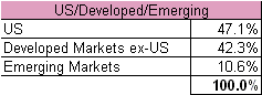
If we look at stocks around the globe through a developed-vs.-emerging-markets lens, here’s how the market stacks up:
Slicing up equities on a more granular level, including breaking out Canada and Israel, gives us the following set of numbers. Why isolate Canada and Israel? Those two markets aren’t always included in regional indices, and so it’s helpful to review the relative weights in perspective:

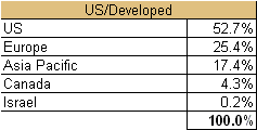
Focusing on developed markets alone delivers this mix:
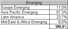
Here’s how the equity pie is divided when we turn to emerging markets in isolation:
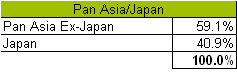
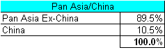
Finally, here’s how Asia compares when we break out Japan, and then China:
Next week I’ll update the relative market weights for the world’s bond markets.
Update: Here are the market-value allocations for the global bond market.