Rising geopolitical stress over the evolving Ukraine crisis has taken a bite out of bullish sentiment lately. With this weekend’s secession referendum scheduled in Crimea, the crowd is again looking for safety. As a result, the risk-off trade is weighing on stocks. US equities are still in the lead among the major asset classes, based on our standard set of ETF proxies via a 250-trading-day window (the rough equivalent of 1-year returns). But the performance edge has been noticeably squeezed since the previous update in late-February. Meanwhile, emerging market assets remain at the bottom of the return ledger, albeit with a degree of red ink that’s more or less unchanged from the last time we crunched the numbers.
Despite the latest retreat in bullish sentiment, the spread between the top- and bottom-performers is still quite wide: nearly 34 percentage points–down only slightly from 38 percentage points in the previous update. Indeed, US stocks (VTI) are higher by nearly 22% over the past 250 trading days while emerging-market bonds (EMLC) are off by almost 12%.
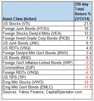
Here’s how the numbers stack up with a graphical summary of the relative performance histories for each of the major asset classes for the past 250 trading days by way of the ETF proxies. The chart below shows the performance records through March 13, 2014, with all the ETFs rebased to 100 based on a start date of March 15, 2013:

Now let’s consider an ETF-based version of a passive, market-value-weighted mix of all the major asset classes–the Global Market Index Fund, or GMI.F, which is comprised of all the ETFs in the table above. Here’s how GMI.F stacks up for the past 250 trading days through March 13, 2014. This investable strategy is higher by 10.2% across that span of time, or roughly midway between the returns for US stocks (VTI) and US bonds (BND) over the same period.

Comparing the overall dispersion of returns for the major asset classes via ETFs suggests that the rebalancing opportunity is still relatively middling for GMI.F overall vs. recent history. Analyzing the components of GMI.F with a rolling median absolute deviation of one-year returns for all the funds–the GMI.F Rebalancing Opportunity Index, as it’s labeled on these pages–suggests that there’s average potential generally for adding value by reweighting this portfolio in comparison with the past 12 months. Keep in mind that the potential for rebalancing will vary depending on the choice of holdings and historical time window. Meantime, don’t overlook the possibility that any given pair of ETFs may present a substantially greater or lesser degree of rebalancing opportunity vs. analyzing GMI.F’s components collectively.

Finally, let’s compare the rolling 1-year returns (250-trading-day performance) for the ETFs in GMI.F via boxplots for a revealing comparison of price momentum across the board. The gray boxes in the chart below reflect the middle range of historical 250-day returns for each ETF—the 25th to 75th return percentiles. The red dots show the current return (as of March 13) vs. the 250-day return from 30 trading days earlier (blue dots, which may be hiding behind the red dots in some cases). Note that all the asset classes are posting relatively high or comparable 250-day trailing returns vs. the numbers from 30 days earlier. It’ll be interesting to see if the bullish bias can survive the next round of geopolitical stress that may come to a head with this weekend’s vote in the Crimea, which Europe and the US have pre-emptively denounced as unconstitutional. (Keep in mind as you look at the boxplot data that the historical records for these ETFs vary due to different launch dates.)
