Risk comes in many flavors and so it’s no surprise that there are hundreds of risk metrics to consider for the toolbox. In a new series of posts, CapitalSpectator.com will highlight some of the lesser-known indicators and review the applications. Let’s start with capture ratios.
The concept is straightforward and deserves attention for the simple reason that capture ratios pack a lot of information about the risk profile for assets in a portfolio relative to the overall portfolio over any period of time you choose to select.
As an example, consider the major asset classes by way of 14 ETF proxies. Before we look at an example, let’s define capture ratios, which come in two varieties: upside and downside.
Upside capture ratio (UCR) quantifies how frequently an asset outperforms relative to a benchmark. A UCR reading of 0.8 indicates an asset outperforms 80% of the time. By contrast, a 1.2 UCR indicates an asset rises 120% of the time relative to the benchmark – i.e., the asset outperforms more often.
The complimentary metric is the downside capture ratio (DCR), or how often an asset underperforms relative to a benchmark. A UCR of 0.8 indicates a lesser frequency of underperformance vs. the benchmark.
The value of these readings is obvious. In a perfect world, an asset would rise more often than the benchmark and decline less frequently. In other words, a perfect diversifier. Reality, unfortunately, is more nuanced. In any case, reviewing a given opportunity set by way of UCR and DCR is quite valuable from the perspective of designing and managing portfolios.
As a simple example, here are results for the ETF proxies for the major asset classes relative to the Global Market Index (GMI), an unmanaged benchmark (maintained by CapitalSpectator.com) that holds all the major asset classes (except cash) in market-value weights. In this example, GMI is holds all the ETF proxies.
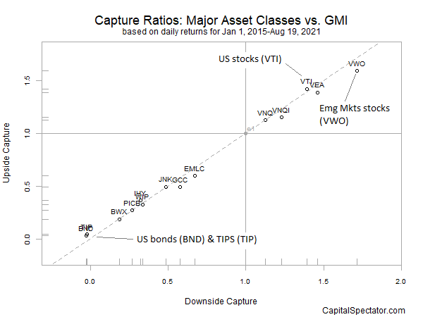
In the chart below, the major asset classes are ranked on UCR and DCR relative to GMI. The metrics are calculated based on daily returns since 2015.

The main takeaway: there’s a strong, positive relationship between UCR and DCR. Higher (lower) UCRs are linked with higher (lower) DCRs. Assets that capture more upside come with a price tag of more downside vis-à-vis GMI. At one extreme: US bonds, which post virtually no outperformance or underperformance tendency vs. GMI.
At the other extreme, emerging markets stocks (VWO) significantly outperform and underperform GMI, which is to say that VWO’s returns are more volatile on the upside as well as the downside.
One of the useful aspects of UCR and DCR is that we can change the benchmark to analyze different portfolio perspectives. In the case of the ETFs above, let’s compare the funds relative to US stocks, shown in the next table below.

The results are similar, albeit with some variation. For example, emerging markets stocks roughly align with US stocks in terms of similar UCR and DCR readings.
Perhaps the real value of UCR and DCR is found in reviewing different time horizons. In the charts above, one-day returns are used. But for deeper perspective we can study how, say, 1-, 3- and 5-year performances compare. We can also look at how one five-year window – 2017-2021 – aligns to another (or doesn’t), such as 2013-2017. Are DCRs and UCRs changing for some or all assets? For some or several benchmarks? If so, what does that imply for changing asset allocation and risk exposure?
In upcoming posts I’ll run additional numbers to explore these questions.
Learn To Use R For Portfolio Analysis
Quantitative Investment Portfolio Analytics In R:
An Introduction To R For Modeling Portfolio Risk and Return
By James Picerno