Searching for a connection between asset prices and the business cycle is no spring chicken. The economist Irving Fisher, for example, theorized a link between short-term interest rates and economic expectations in his 1907 book The Rate of Interest. This was also the formative period for the Dow Theory. The strategy’s chief proponent, William Peter Hamilton, editor of The Wall Street Journal during the early 20th century, outlined the case for using the stock market as a proxy for measuring the ebb and flow of the economy. Reviewing the nexus between the broad trend and the market, Hamilton advised in his 1922 book The Stock Market Barometer
: “What we need are soulless barometers, price indexes and averages to tell us where we are going and what we may expect. The best, because the most impartial, the most remorseless of these barometers, is the recorded average of prices in the stock exchange.”
Modern asset pricing theory also looks to financial markets for clues about macroeconomic explanations and vice versa. “The program of understanding the real, macroeconomic risks that drive asset prices (or the proof that they do not do so at all) is not some weird branch of finance; it is the trunk of the tree,” writes professor John Cochrane in the textbook Financial Markets and the Real Economy. “As frustratingly slow as progress is, this is the only way to answer the central questions of financial economics, and a crucial and unavoidable set of uncomfortable measurements and predictions for macroeconomics.”
Wesley Mitchell and Arthur Burns understood this in 1938, when they decided to include the stock market (S&P 500) in their design of a leading indicator index for assessing the business cycle. But stocks, for all their value for assessing expectations, are but one variable, a point that Mitchell and Burns were careful to emphasize. Good thing too, since the stock market is hardly infallible.
The same can be said for every other predictor, even if some analysts suggest otherwise. Nonetheless, the stock market remains a popular measure of expectations about the business cycle, even though it’s been know to predict recessions that never materialize. The market’s mixed record tempts some to dismiss it entirely, but that’s premature. As I discussed a few months back, there’s a connection between equity returns and the business cycle, based on industrial production as a macro proxy via cross correlation analysis. Granted, correlation isn’t causation, but theory suggests that we shouldn’t ignore the apparent role of stock prices as a leading indicator of the broad trend.
But there are many views on how to interpret the equity market’s discounting signals and so it’s not obvious how to proceed. As a benchmark, we might start by reviewing 12-month price changes to filter out some of the short-term noise. History reveals that recessions are usually associated with 12-month losses in the market. But this is less useful if you’re looking for timely investment signals. “The stock market itself is a short-leading indicator of recession, so from an investor’s standpoint, coincident or short-lagging recession indicators are not as useful as one would wish,” laments John Hussman, portfolio manager at the Hussman Funds. “By the time it’s safe to proclaim a recession and close the barn door, the horses are already out.” Nonetheless, Hussman recommends watching the S&P 500’s six-month performance as an early warning of macro trouble, reminding that “falling stock prices are very important as part of the broader syndrome” for estimating recession risk.

History doesn’t disagree. In 1991, Jeremy Siegal reported that 38 or the 41 previous recessions since 1802 “have been preceded by an 8% decline in the stock returns index.” That sounds great as a general proposition, but the analytical challenge can be rather intimidating in real time. But here we are, debating the cycle’s next move and as of January 19, 2012 the S&P 500 is up 3.2% on a price basis over the past year, according to data from the St. Louis Fed. Is that a sign that the crowd’s feeling good about the outlook for the economy?
Maybe, although Bob Dieli of RDLB, Inc.—a.k.a. Mr. Model—advises that there’s a gray area when it comes to reading the equity market’s tea leaves in a macro context. In his latest research note for clients, he considers the year-over-year change for the S&P 500, based on the month-average values using daily closes. “This makes for a slightly smoother series than what you get if you use month-end data,” but in Dieli’s view “the series has a perfectly awful record in forecasting recessions,” as per his chart below.

Dieli continues,
The red and green lines go across the page at +10% and -10% [in the chart above], and they are there for two reasons. First, when the blue line goes through those numbers from above and below, those intersections are pretty close to business cycle events, where there are business cycle events. Second, the red and green lines define an area that I call the Zone of Death (ZOD) so named because the blue line does not like to spend much time between the red and green lines. Any time the blue line is in the ZOD I get a lot of calls from my friends in the equity management business (and you know who you are) expressing more than their usual level of anxiety about the trend of the market. I don’t make market calls. But I do try and tell them whether the latest venture into the ZOD will be associated with a recession. For the record, there have been more trips into the ZOD than there have been recessions.
In search of a more reliable predictor of the macro cycle, Dieli prefers what he calls the aggregate spread, defined as the arithmetic combination of two other spreads: 1) the Financial spread, or the difference (in basis points) between the long bond and the Federal funds rate; and 2) the difference between the inflation rate and unemployment rate. The aggregate spread is designed as a tool to call turning points in the business cycle, which it “does very well,” according to Dieli. The encouraging record inspires Jeff Miller at A Dash of Insight to report that “the Dieli method,” which draws a fair amount of context from the aggregate spread, “has worked better than any other method in real time” in the dark art of recession forecasting.
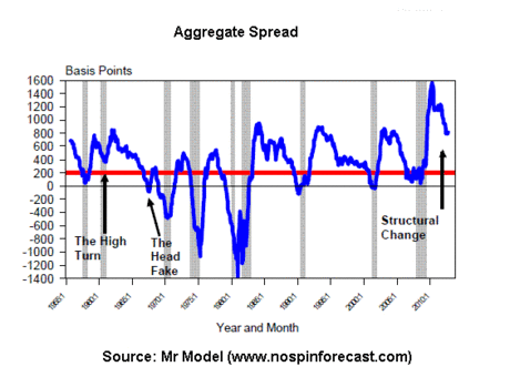
The elevated level of Dieli’s aggregate spread at the moment implies that the risk of a recession in the near term is relatively low, a view that claims some support form the Treasury yield curve, falling jobless claims, and some other indicators. Perhaps we can include the stock market in the positive column… perhaps not. The jury may be out on the equity market’s forecast, although Scott Grannis notes that market “panic is slowly fading.”
There’s no shortage of like-minded optimism at the moment. “We think things are setting up to be better than last year,” says Brad Sorensen, director of market research at Charles Schwab. “The worst-case scenario is off the table.” That may be tempting fate, but there’s some fresh quantitative support for thinking positively in the latest reading of the Philadelphia Fed’s Aruoba-Diebold-Scotti business conditions index, which is “designed to track real business conditions at high frequency.”
But what of the known unknowns? There are plenty of risks out there that could upend the rosy expectations. For some “What If?” scenarios for the year ahead, Simon Constable in the Wall Street Journal reviews several of the suspects du jour.
There are more than vague scenarios that threaten to derail the modest growth trend in the U.S., several cautious analysts warn. In his latest weekly update published today, Hussman continues to insist that “recession risk remains very high based on the leading evidence.” Meantime, the Economic Cycle Research Institute (ECRI), which made a recession forecast last September has been sticking to its prediction every since. “ECRI’s recession call remains quite controversial in financial circles,” notes Doug Short. Fair enough, although what everyone really wants to know is whether it’s right… or not.