Building “optimal” portfolios—maximizing return and minimizing risk–is a foundational concept in quantitative finance. Unfortunately, it’s not terribly practical. The problem, as many researchers have demonstrated over the years, is the elusive aspect of developing reliable estimates of return and risk. Mere mortals are notoriously ill-suited for such things. But crunching the numbers and identifying theoretically optimal strategies is still useful as a benchmark for thinking about how to design and manage your real-world asset allocation and framing history in a productive way.
Granted, it’s not worth spending too much time on this project. The good news is that we can let the computer do all the hard work. As one example, let’s use the fPortfolio package from Rmetrics, which runs in R. To replicate the results below, here’s the code.
But first let’s think about why we would want to run optimal portfolio analytics in the first place? After all, we have, at best, cloudy notions of expected risk and return numbers. Isn’t this an exercise in futility? Not necessarily. Optimization per se isn’t going to going to help us predict the future, although it can be useful to help us understand the past on a deeper level. As it turns out, that’s a necessary condition for boosting the odds of investment success. There are many ways to reach nirvana and optimization research is one path, although not necessarily for the standard reasons for which this methodology was designed.
For the sake of illustration, imagine that we’ve decided to build a globally diversified portfolio with the following ETFs and mutual funds with prices starting in 2000.
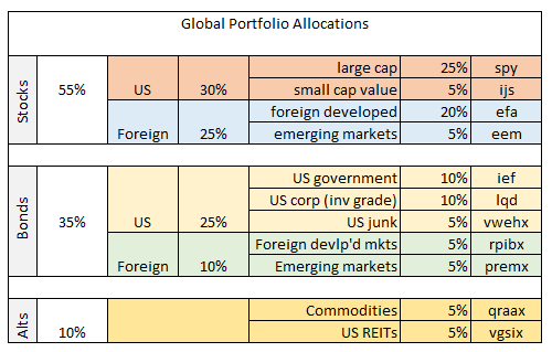
The asset mix boils down to 55% global equities, 35% global bonds, with 10% in commodities and real estate (real estate investment trusts). In short, a reasonable first approximation for a diversified asset allocation. One question is how this allocation compares with the recommendation by way of running the historical risk and return numbers through an optimizer?
Let’s start by looking at a chart that identifies the optimal portfolio, albeit based on a rear-view mirror and assuming a long-only strategy. The black triangle below shows the asset allocation with the highest return with the lowest level of risk (based on annual returns via monthly data). This is the tangency portfolio, where the optimal curve touches the capital market line, shown in blue. The red dots are the individual ETFs listed above. The blue triangle is the equally weighted mix of funds. The small gray dots represent 5,000 randomly generated portfolio mixes. To summarize, the optimal portfolio’s return is about 6.6% with risk (volatility) of roughly 3.4%. In risk-adjusted terms, that’s rather impressive, at least compared with most results in the real world. Ah, the benefits of 20-20 hindsight.

So, what’s the catch? For starters, the chart above shows optimized results based on historical data. Been there, done that. We know what worked in the past, but it’s not obvious that history’s winning recipe will deliver comparable results going forward.
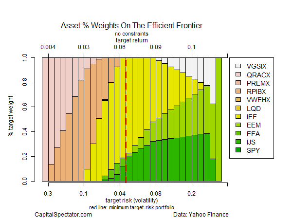
Another sticking point is that the optimization above is unconstrained. In other words, I gave the computer complete freedom to select the allocations. Not surprisingly, the best choices tend to be extreme as we move closer to the optimal mix.
The next chart shows the weights for the unconstrained optimization. The vertical dashed red line marks the optimal portfolio. Note the hefty weighting of US government bonds (IEF) at roughly 80% (yellow bars).
Now let’s run the analysis with some constraints—a minimum weight of 5% but no more than 50% for any one ETF. The result is that the optimal portfolio’s return ticks up slightly (7.1%), but at a price tag of nearly doubling the amount of risk (6.4%).
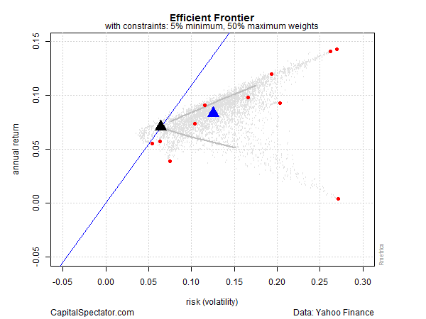
By design, the asset mix has been moderated in the constrained analysis. Note that the US government bond allocation (IEF) is now just a hair under the 50% maximum allocation. IEF still dominates, but in a materially lesser degree, as shown in the next chart below.

What can we do with this information? We might start by considering how our original asset allocation compares. For instance, in the outline in the table above, US government bonds (IEF) held a relatively low 10% weight. By contrast, the optimizer wants to raise that weight dramatically? Hmmm…
If this was an actual research project, I’d further test the results with expected risk and return numbers—using equilibrium-based forecasts or simulated returns, for instance. Crunching the numbers with alternative risk metrics—conditional value at risk (aka expected shortfall), for instance—is recommended as well to model tail risk and take stress-testing to the next level.
The larger point is that optimization analytics offer context for reviewing existing portfolio designs that arise from other methodologies. Everyone has preferences, of course, but we all suffer the same burden: an uncertain future. In that sense, every methodology is flawed. But the flaws can vary dramatically, which is why it’s prudent to run the numbers through a variety of systems.
Identifying the optimal mix ex-post is one piece of the puzzle. In the toy example above, the results suggest that we should sharpen the debate regarding the role of US government bonds going forward. In the past, this asset class was a crucial input in an optimization context. Will it remain so going forward? Or is the hefty role that IEF previously played in generating optimal and near-optimal results destined to remain an outdated artifact of history? Minds will differ, of course, but the analysis above provides a quantitative reminder that this is a critical topic for discussion at the next investment committee meeting. The past may or may not be a guide to the future, but it’s essential to have a clear understanding of how we’ve arrived in the here and now.
Optimization helps frame the answer. You may think you already know enough by casually looking at your portfolio mix. But you may be surprised at what you find by running the quirky figures of your asset allocation through an optimizer. This is especially valuable information if you’re going to discuss portfolio design with family members or, if your in the business, with colleagues. Why? Because it’s a relatively objective baseline. You’re free to dismiss the implied recommendation, which is fine and perhaps inevitable. But the odds are pretty high that you’ll something new about your strategy, which may be helpful for managing risk going forward.
Pingback: 07/06/15 - Monday Interest-ing Reads -Compound Interest Rocks
Pingback: Quantocracy's Daily Wrap for 07/06/2015 | Quantocracy
hi james
thx for the post.
is it true that simulating numerous portfolios under the assumption of normality using the same exp return, standard deviation and correlation, as what would be input into an optimization algorithm, will produce the same efficient frontier (when tracing a line through the highest expected return for a level of expected volatility out of all the simulated portfolios)? it seems that way from your plots (well, the unconstrained plot) but wanted to double check.
many thx.
d,
If you hold expected return, risk and correlation constant for all the assets, the estimated frontier won’t change. That’s effectively what I show in this post, albeit using historical results based on ETFs. The value of simulations is varying risk, return, and distribution expectations to study the effects on the efficient frontier and the associated asset weights. That’s one way to stress test assumptions.
–JP
Pingback: Links – Week of July 13, 2015 | Signal/Noise
thx for the reply.
yea, i guess what i meant is that you can solve the classic mean variance portfolio allocation problem in closed form using lagrange multipliers. i wasnt sure if running a whole bunch of simulations and then tracing out the curve of the highest return per unit of risk amongst all the simulations would give equivalent results. does it?
d,
Ah, good question. Don’t know the answer off the top of my head. I’d need to do a bit of manual coding–the fPortfolio package I used won’t be useful here. I guess the issue is what happens when we impose an equality constraint via lagrange. Hmmm…