Equity markets are down, which means that dividend yields are up.
It’s a fundamental relationship, and one that endures. No wonder, then, that a growing body of academic research (and a healthy dose of common sense) counsels that the relationship produces valuable clues for strategic-minded investors. In short, raise equity weights when yields are relatively high, and trim that exposure when yields are relatively low. Ideally, such shifts are done gradually, over time, to manage the risk that no one really knows if current yields will remain the apex, or trough, for the cycle.
There are other factors to consider in managing portfolios of course. For the moment, however, we’ll focus on dividend yields, which are up these days, as our chart below shows. Indeed, some corners of the world’s equities markets are sporting rather attractive yields, relative to recent history.
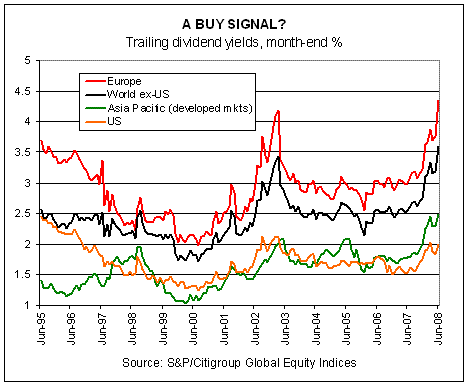
Europe leads the way among the globe’s major regions, posting a 4.35% yield (based on the trailing 12 months) as of June 30, 2008. (All data is via S&P/Citigroup Global Equity Indices.) How high is 4.35%? It’s the highest in at least 13 years. After factoring in the selling so far this month, the current trailing yield is almost certainly a bit higher today.
Monthly Archives: July 2008
THE MEANING OF VOLATILITY
Yesterday we profiled correlations; today, we update volatility.
In preview, vol is up, which is to say that it’s no longer down, as it was for several years previous. The bear market in volatility ended in late 2006/early 2007, as our chart below reminds. As it happened, the windup in vol’s decline preceded the start of the bear market in equities. If you’re thinking that volatility’s nadir was a clue of things to come, you’re right. In fact, we considered no less in the recent past, including this post from January 2007, when we advised, after a long spell of falling standard deviations: “Higher volatility is probably coming, one day, and history reminds that sometimes higher volatility is forged by falling prices.”

But that was then. What of the future? As always, we can only guess. Fortunately, we can also learn from history. No, not everything is revealed by looking backward, and certainly not with full clarity about what’s coming. Still, Mr. Market leaves a few crumbs of insight about the morrow.
On that front, volatility at the moment has little to tell that we don’t already know. Yes, standard deviations in the major asset classes are rising, as we suspected they would after reaching unsustainable lows in late 2006/early 2007. Based on the above chart, one may expect that vol still has a ways to go, which suggests that the selling isn’t about to dry up just yet.
DIVERSIFICATION UPDATE
Diversification isn’t everything, but it’s a lot. And sometimes, it’s everything.
It doesn’t take much analysis to recognize that asset allocation’s value has risen sharply this year. More precisely, the right asset allocation has generally made the difference between losing a lot of money and either losing a little or even turning a profit this year. Even a passive asset allocation across the major asset classes has generated potent benefits. Indeed, the year-to-date performance numbers for the major asset classes midway in 2008 are wide ranging, as we noted last week.
That’s in sharp contrast to the horse race as it looked mid-year in 2007, when almost everything was running higher. No wonder that halfway through 2007 there was chatter that asset allocation was washed up as a strategic tool. Who needs to own everything when robust returns are falling out of trees?
So it goes in the cyclical mindset of investing analysis for the crowd, which too often succumbs to belief that the recent past informs the future. Yes, wisdom on Wall Street tends to wax and wane over time, but on these digital pages diversification’s value endures, as our update on correlations remind.
But let’s be clear: diversification is anything but static. It prevails over time, but in the short run its offerings vary, as our chart below reminds. (For easy reading, click to launch a larger view of the chart.)

Let’s start by noting that as equity markets have corrected this year, correlations between the U.S. stock market (Russell 3000) and foreign markets have trended higher. (Correlations range from 1.0, or perfect positive correlation, to -1.0, perfect negative correlation. Generally, mixing assets with less than perfect correlation improves expected risk-adjusted performance.) The same can be said of U.S. stocks and REITs. That’s par for the course in bear markets, where like-minded products tend to dive together. Of course, there are always a few surprises along the way. The fact that the correlations between REITs and equities is so high of late can be chalked up as bad luck born of the fact that bull markets in real estate and stocks seemed to have peaked together this time around.
Meantime, look at the brown, purple and blue lines in the bottom right-hand corner of the chart. Note that all have been falling for the past year or so relative to the Russell 3000. (For simplicity, all correlations in the chart are calculated relative to the Russell 3000.) Unsurprisingly, all three of these lines (representing commodities, U.S. bonds and foreign-government bonds denominated in foreign currencies) have historically provided valuable diversification benefits relative to stocks when the diversification is needed most. By the standards of the first half of this year, those benefits are once again alive and kicking.
A SLIPPERY RISK PREMIUM
Oil is a commodity, but it’s also something more, and therein lies the complication. And risk and opportunity.
The dual status of oil as raw material and proxy for global macroeconomic risk dates to at least the 1973-74 oil crisis, when OPEC waged an economic war against the West with crude as its primary weapon in support of the Arab attack on Israel. Although oil was used previously as a strategic weapon, the events of 1973-74 elevated the commodity’s profile on the global stage on that front to unprecedented heights. Since then, oil’s price has reflected the forces of both supply and demand, and global risk perceptions.
Supply and demand are almost always the dominant pricing factor. Global risk’s influence on price, by comparison, waxes and wanes. In the late-1990s, the risk premium in oil was relatively low; today, it’s quite high.
No one can say for sure how much risk impacts price for oil on any given day. But it’s clear that crude is not just another commodity. Yes, gold too is influenced by global risk, but gold has no strategic economic use. Jewelry and industrial demand are pricing factors for the precious metal, but those applications are hardly critical in the global economy. In any case, most of the gold mined in history sits in vaults and safe-deposit boxes and so no one worries about a shortage. The only question is price, which is largely driven by sentiment and the vague memories that the metal was once used as legal tender. We don’t discount gold’s value as indicator of danger in the world economy, but in terms of practical applications it’s virtually irrelevant next to oil.
232 YEARS AND COUNTING…
Happy Independence Day to all our readers. Here’s our favorite excerpt from the seminal document:
We hold these truths to be self-evident, that all men are created equal, that they are endowed by their Creator with certain unalienable Rights, that among these are Life, Liberty and the pursuit of Happiness. — That to secure these rights, Governments are instituted among Men, deriving their just powers from the consent of the governed, — That whenever any Form of Government becomes destructive of these ends, it is the Right of the People to alter or to abolish it, and to institute new Government, laying its foundation on such principles and organizing its powers in such form, as to them shall seem most likely to effect their Safety and Happiness. Prudence, indeed, will dictate that Governments long established should not be changed for light and transient causes; and accordingly all experience hath shewn that mankind are more disposed to suffer, while evils are sufferable than to right themselves by abolishing the forms to which they are accustomed. But when a long train of abuses and usurpations, pursuing invariably the same Object evinces a design to reduce them under absolute Despotism, it is their right, it is their duty, to throw off such Government, and to provide new Guards for their future security.

John Trumbull’s “Declaration of Independence”
STIMULUS OR BUST
The stimulus checks may be propping up consumer spending, at least temporarily, but the job market is still weakening.
Initial jobless claims jumped to 404,000 mark last week, up from 388,000 the week previous the Labor Department reports. That’s only the second time the 400,000 mark has been passed on the upside in many a moon, the previous instance coming this past March 29 when claims reached 406,000.
As our chart below shows, the trend is clear: new filings for unemployment benefits continue running higher. It’s not clear that the stimulus checks will deliver salvation. There are many negatives weighing on the economy, from rising energy prices to the unwinding of various debt burdens, and those ills aren’t about to evaporate next week because consumers are receiving checks in the mail for $600 to $1,200.

Reading the writing on the economic wall, Washington is now talking about a second stimulus package.The political inclination to act is understandable, but at some point the correction will have its way. Trying to keep the growth cycle alive indefinitely isn’t plausible, nor is it possible–or even healthy. Yes, the past 20 years suggests otherwise, but the pain has simply been pushed forward.
Strong growth ultimately arises from ashes of recessions–a harsh but ultimately accurate fact. Artificially keeping the growth alive in order to avoid recessions risks nipping future growth in the bud. Again, politics calls for no less, but in the end it’s not obvious that letting the political mindset run the show is the best long-term strategy for the man in the street. That won’t stop Washington from moving heaven and earth to try and re-engineer a more comforting outlook, although the patient may not respond as expected this time.
A MONTH OF SEEING RED
Blood was definitely running in the streets last month.
As our table below reminds, red is now the dominant color in performance tallies. But black hasn’t been completely banished. For those who owned commodities, inflation-indexed Treasuries or cash, June wasn’t a complete loss.

Commodities, of course, were the big winner last month. The Dow Jones-AIG Commodity Index surged more than 9% in June and is now up 27% so far this year, based on the exchange traded note proxy cited in our numbers above. Clearly, if you didn’t have commodities exposure in your portfolio, your portfolio suffered.
Although it’s tempting to chase the hot performance in commodities, strategic-minded investors should be wary at this point. The DJ-AIG Commodity index, like all commodities benchmarks, has been rallying for years. The last calendar year loss for DJ-AIG Commodity was 2001. If the index manages a gain by the end of 2008, that will mark the seventh straight year of calendar year gains.
No, we’re not willing to say when the commodities boom will end. For all we know, it’ll go on for another seven years. Then again, it could end tomorrow. As a general rule, however, the longer any asset class rallies, the more cautious we become on estimating expected returns. At the same time, the longer asset classes endure selling, the more optimistic we become.