CNNMoney calls it a “high wire act.” BusinessWeek says Bernanke “faces stiff headwinds.” And Allan Meltzer in today’s Wall Street Journal asks if the Fed has “reverted to its mistaken behavior in the 1970s?”
The immediate source of the sobering commentary is yesterday’s chit chat between the House financial services committee and Fed Chairman Bernanke, who emphasized that the central bank is focused on the softening economy, by which he means that inflation fighting is of secondary import, at least for now. Suffice to say, that’s a provocative idea with inflation on the rise. In any case, it’s clear that more interest rates cuts are coming, a prospect that helped the dollar sink to new lows against the euro and raise questions anew about the future of inflation in these United States.
“The continued focus on the weak growth outlook supports our view that the Fed will cut rates by 50 basis points – when it meets on March 18 – and will continue to cut rates beyond that in order to limit the downside growth risks,” Drew Matus, economist at Lehman Brothers, told the Financial Times today.
Hardly anyone disagrees, although not everyone’s celebrating. “Bernanke has really overweighted the economic risks relative to inflation,” John Silvia, chief economist at Wachovia Corp. explained in a Bloomberg News story. In fact, “he may get some disagreement” among colleagues on the Federal Open Market Committee, Silvia speculated.
WHOLESALE PRICES KEEP RISING
This morning’s update on wholesale prices brings more bad news on the inflation front. Producer prices jumped a seasonally adjusted 1.0% last month, elevating the 12-month pace to an eye-popping 7.7%–the highest since September 1981.

Higher energy prices are partially responsible for PPI’s ascent, but this is no longer solely about oil and gas prices, as today’s report reminds. A few examples from the Labor Department’s press release:
* The index for finished goods excluding foods and energy accelerated to 0.4 percent in January from 0.2 percent in December.
* The index for pharmaceutical preparations advanced 1.5 percent after increasing 0.4 percent in the prior month.
* Prices for light motor trucks and passenger cars turned up after falling in December.
* The Producer Price Index for Intermediate Materials, Supplies, and Components rose 1.4 percent in January following a 0.2-percent decrease in December. This upturn was broad based.
RULES OF THE GAME
Inflation seems to be bubbling again in the U.S., but not enough to convince everyone that the pricing cat’s out of the bag. But if it’s still easy to dismiss America’s uptick in pricing pressures, the task becomes tougher when considered globally.
As inflationary sightings around the world rise, the probability also increases that the general trend reflects something more than a statistical anomaly of limited relevance. The reasoning unfolds as follows: Inflation is primarily if not wholly a byproduct of monetary mismanagement. Meanwhile, there are many central banks operating on the planet, and many operate independently of their counterparts. The evidence is found in the fact that rates of inflation and money supply growth and interest rates vary. No one would confuse the state of monetary affairs in Japan, for instance, with that of the U.S. Japan has a number of economic challenges, but rising inflation isn’t one of them. The U.S., by contrast, seems to be looking at a more challenging inflationary scenario. To the extent that such differences apply, the source of the praise or disapproval frequently lies with the local central bank.
Of course, globalization has dimmed the power of central banks compared to the past. But the loss of sway over prices is far from absolute. Central banks still matter, which is to say they continue to wield enormous influence over prices in the long run. Accordingly, central banks, if they’re so inclined, can unleash the forces of higher or lower inflation.
REAL CHOICES
Several astute observers of the financial scene have noticed recently that the yield on the 10-year inflation-indexed Treasury bond (a.k.a. the 10-year TIPS) has fallen to levels that look distinctly unattractive. Of course, one might ask: Unattractive compared to what?
There’s no doubt that the 10-year TIPS yield has fallen sharply in recent months. As of last night’s close, buying a 10-year TIPS equated with locking in a real (inflation-adjusted) yield of 1.43% for the next 10 years. Meanwhile, the always-perfect clarity of the rear-view mirror tells us that a better time to buy was last June, when the 10-year TIPS yield briefly rose to 2.83% at one point that month.
Since then, the TIPS yield has been falling virtually nonstop. Of course, the same is true for the nominal 10-year Treasury yield. Last June, the nominal 10-year was temporarily available at 5.23%, a relatively alluring yield that’s since fallen to 3.77% as of yesterday.
Suffice to say, yields generally are now lower–a lot lower, in fact, compared with the prevailing rates of last June. But the decline has not been distributed evenly in the land of Treasuries. On that note, consider the chart below, which compares the yields of the 10-year TIPS with the nominal 10-year Treasury, the latter adjusted by the 12-month rolling CPI rate. (Both series are based on constant 10-year maturities using monthly data, as per the St. Louis Fed.) The result is a back-of-the-envelope attempt at putting the two Treasuries on roughly equal footing in terms of comparing real yields.
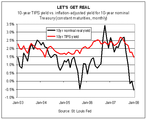
The striking feature of the chart is that inflation-adjusted yield in the nominal 10-year Treasury has sunk to an unappealing depth of roughly negative 50 basis points. In other words, adjusting the nominal 10-year yield by the latest CPI number (which reports annual inflation running at 4.3%) means that a buyer today would suffer a loss after subtracting inflation’s bite.
ANOTHER DISCOURAGING INFLATION REPORT
Anyone who thinks inflation isn’t a problem isn’t looking at the numbers. It’s not a huge problem, it’s not a catastrophic problem. But it’s a problem, and it requires attention. Left untended, it’ll only get worse. And once the public thinks it’s destined to get worse, the Federal Reserve’s looking at a much bigger problem and one that could take a generation to reverse. The good news is that the problem is still manageable. Nonetheless, the clock is ticking.
Consumer prices rose 4.3% during the 12 months through last month, the Bureau of Labor Statistics reported this morning. As our chart below shows, that’s near the peak for the past 10 years. Core inflation (which excludes food and energy prices) is also pushing higher these days, running at a 2.5% annual pace, which is near its highest levels in recent years too.

Headline inflation is now far above the overall growth rate of the economy, which expanded by a paltry 0.6% in annualized real terms in last year’s fourth quarter. Even GDP’s 3.2% growth in nominal terms remains comfortably under CPI’s pace.
The inflationary pressure is all the more troubling with the Federal Reserve aggressively lowering interest rates of late, a course which increasingly looks like the monetary equivalent of throwing gasoline on a fire. Fed funds are currently 3.0%, down from 5.25% as recently as last September. As a result, Fed funds are now negative in inflation-adjusted terms. And more rate cuts may be coming. The April ’08 Fed funds futures contract is priced in anticipation of another 50 basis-point cut, which would bring rates down to 2.5%, or nearly 200 basis points below CPI’s pace.
Meanwhile, no one should mistake the inflationary momentum as a statistical artifact. The bubbling pricing pressure is evident in several crucial corners of goods and services. Food, energy, transportation and medical care prices are all advancing at annual rates above headline CPI’s pace, according to the government’s report today.
The Fed has been expecting that the slowing economy would take the edge off inflation. So far, however, nothing of the sort is happening. As GDP’s pace has slowed, inflationary pressure has only risen. So much for wishful thinking. That leaves the traditional solution, which is one of embracing a hawkish monetary policy, at least relative to what currently prevails. That’s an awkward prescription in an election year, especially one in which recession threatens. But no one ever said that running a central bank is a short cut to popularity. It remains to be seen just how much popularity Mr. Bernanke and company seek.
DISTRESS & TRANSITION
The future remains as murky as ever, but the questions are becoming increasingly obvious.
Let’s start with three. There are many more, of course, but these three seem particularly topical and so knowing the answers to the following questions—topics, really– would be immensely helpful for enhancing investment returns and all but eliminating risk. Unfortunately, that would require financial and economic clarity, both of which remain in short supply.
There’s always a delicate balance of risk and reward, of course, and it’s always laden with mystery as to what comes next. But the current outlook carries a bit more potential for each. So it goes in moments of distress and transition. In theory, asset allocation may warrant more extreme strategies when (and if) the valuations become immoderate. On the other hand, if valuations are generally middling, the case remains strong for broad diversification among the asset classes.
READING BETWEEN THE LINES IN JOBLESS CLAIMS DATA
Today’s update on weekly jobless claims is encouraging, but no one should confuse last week’s sizable decline in new filings for unemployment benefits with the all-clear signal for the economy. There are still too many risk factors bubbling to convince us that full-bore optimism is now the sentiment of choice.
The Labor Department reported that jobless claims fell to 348,000 for the week through February 9, down from a revised 357,000 the week before. That’s a handsome tumble, but as our chart below reminds the broader picture (as indicated by the black line, which graphs the linear trend) still doesn’t look encouraging.
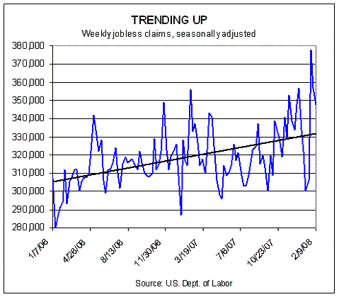
Weekly jobless claims are, of course, a volatile series in the short run. Extreme weather conditions, for instance, can arbitrarily reverse long-run trends in any given week. But if we step back and consider the big picture, it’s hard to dismiss the rise in initial jobless claims as anomalous and unrelated to economic conditions of late. Indeed, it’s because we know of the pain unfolding in the wider economy that we see the growing jobless claims trend for what it is: a warning sign.
SPREAD ANALYSIS
Repricing of risk is, in theory, a fertile time for minting new opportunities for strategic-minded investors. But, of course, there’s a catch: the financial gods always forget to send instructions for making sense of the upheaval. That leaves mere mortals with the task of sifting through the data in the hope of finding order amid the chaos.
With that prelude, we present the widening spreads in two asset classes that have caught our eye in recent weeks: high yield bonds and REITs. Both have fallen on hard times of late, and so it comes as no shock to learn that their respective trailing yields over the 10-year Treasury’s counterpart looks compelling, relative to recent history.
Consider the chart below, which shows that spreads in junk bonds (represented here by monthly data for the Citigroup High Yield Index through the end of last month) have risen to the highest level since mid-2003. REIT spreads have improved too, but less so. Nontheless, FTSE NAREIT Equity REIT Index’s spread over the 10-year has climbed to its highest mark since the spring of 2004.

Of course, higher spreads by themselves are no guarantee of easy profits from here on out. Indeed, Mr. Market never reveals his game in advance and so all the usual caveats apply when reading the past in the hope of divining the future. Nonetheless, we’re a believer in the proposition that lower prices equate with higher prospective returns. The trick is deciding when prices are at or near the end of their descent, at which point expected returns are at their highest. No one really knows, of course, at least not in real time, which suggests that diversifying one’s opportunistic buying efforts over time and over different asset classes is still the best game in town.
THE DOLLAR, THE EURO & OIL
The notion of pricing oil in something other than dollars has been around for some time. In fact, there’s been a bull market in predicting just that, motivated in recent years by the buck’s general descent in foreign exchange markets and the resulting financial pain the trend has imposed on foreign oil exporters. But rarely, if ever (as far as your editor can tell), has any high-ranking OPEC official discussed the idea in public in direct and transparent terms. Until now.
On Friday, OPEC Secretary-General Abdullah al-Badri told The
Middle East Economic Digest: “Maybe we can price the oil in the euro. It can be done, but it will take time,” according to AFP. He also observed via The Guardian: “In oil exchanges in New York, Singapore or Dubai, you can see the currency is the euro or the yen. But as long as we see the final sign in dollar, that means the pricing is in dollars. It took two world wars and more than 50 years for the dollar to become the dominant currency. Now we are seeing another strong currency coming into the [marketplace], which is the euro.”
Talking about pricing oil in something other than dollars is easy, of course. Doing it is something else entirely. The world’s oil market is still firmly tied into pricing crude in dollars, and changing the financial infrastructure will, as al-Badri said, take time–years, perhaps decades. At the same time, no one should dismiss the growing incentive to tackle this task, and where there’s a will there’s a way.
CORRELATION UPDATE
The repricing of risk in the capital and commodity markets may be intimidating, but it’s a natural, recurring process, and one that often brings fresh opportunity (along with new and so perhaps unexpected risks) for strategic-minded investors.
Periodic rebalancing as a general rule is a good idea, perhaps more so than usual these days given the rise in volatility in some asset classes and the growing sense that more than the usual demons haunting the markets and the economy may be lurking in the shadows. All of which provides a timely excuse to update the correlation trends between stocks, bonds, REITs and commodities if only to see how the recent turmoil in markets has reshuffled the relationships between the asset classes.
To keep things manageable, we’ve crunched the correlations from a U.S. stock market perspective (see chart below by clicking for larger image). The decision doesn’t mean that looking at correlations from the vantage of bonds or REITs or commodities is unproductive. Indeed, a full and prudent study of correlations demands considering all the angles. But in the interest of brevity, today we look exclusively at how correlations have evolved vis a vis U.S. equities, as represented by the Russell 3000, which is a broad measure of the market.
click for larger image
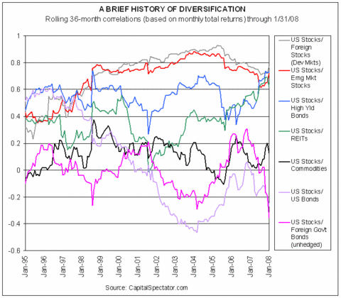
Indices used in calculation: Russell 3000, Lehman Bros. Aggregate Bond, DJ Wilshire REIT, DJ-AIG Commodity, iBoxx High Yield, Citigroup
Non-$ World Govt (un Hdg, $), MSCI EAFE, MSCI EM
Before we start analyzing the trends, let’s first define some terms. The chart above profiles 36-month rolling correlations based on monthly total returns for the respective markets. For example, the correlation between U.S. stocks and commodities for January 2008 comes from a correlation derived on the previous 36-month total returns for each asset class. Correlation measures the relationship between two data series, in this case monthly total returns. A correlation of 1.0 equates with perfect positive correlation, meaning that the two markets are effectively one and the same, or at least highly similar. A correlation reading of 0.0 is no correlation, and a correlation of -1.0 is perfect negative correlation. And, of course, there’s a strong case for building portfolios by mixing asset classes with low and negative correlation. The devil’s in the details, but as a general rule this one carries a lot of weight in our book.