The theory of peak oil remains as contentious as ever and by definition unresolved. The supporting evidence starts with the bull market in crude prices in recent years, inspiring some to proclaim that global production is about as high as it ever will be.
The optimists counter that technology will save the day, through new discoveries that offset declining production from aging fields and recovering more oil from older wells that would otherwise run dry.
The jury is still out on the big picture, and it may remain so for years. In the meantime, there is no shortage of data to review. Case in point: the reported peak (so far) in global crude oil production came in May 2005 at 74.3 million barrels per day (bpd), as our chart below shows, according to numbers from the U.S. Energy Information Administration. In fact, there’s been only three months when global production crossed above 74 million bpd, the latest one coming last October at 74.1 million bpd, or just below the May 2005 summit.
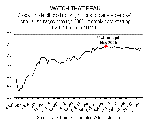
It’s any one’s guess if the old high will stand or not. And, of course, there are questions about the accuracy of EIA’s numbers. In fact, there’s skepticism regarding any database attempting to consolidate such an unwieldy beast as the world’s oil production into one number. Nonetheless, everyone will be watching the updates, eager to declare victory for their side. All the more so considering how close last October’s total was to the May 2005 apex. As we write, EIA’s monthly production figures run through October 2007; the November report is coming soon.
Meantime, as the world ponders the supply side of the oil market, there’s far less mystery on the demand side. In fact, it’s the same old story: up, up and away.
26 YEARS AND COUNTING…
There’s been a lot of talk of bubbles lately, including speculation on where the next one lies. Some say it’s in the energy sector; others claim that gold’s a bubble. Here’s our nomination: bonds.
Our proxy for fixed-income is the ever-popular 10-year Treasury, the benchmark for U.S. debt markets and in some cases foreign markets too. Exhibit A in our bubble thesis is the chart below, which shows the daily closing yield of the 10 year for 40 years-plus through last night’s close. Restating the graphically obvious: the great decline in yield for the past 26 years. Since the peak of 15.84%, set on September 30, 1981, the 10-year Treasury’s yield has, with fits and starts, become a shadow of its former self.
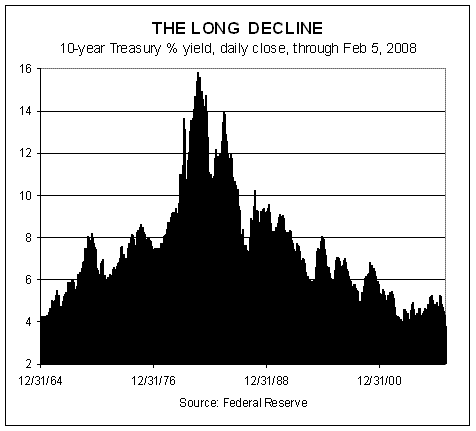
As of yesterday’s close, the 10 year trades at 3.61%–a tidy 1200 basis points below the 1981 summit. In fact, that’s not the lowest yield in recent memory. In June 2003, the 10-year yield briefly dipped to 3.20% (measured by daily closes) and 3.09% on an intraday basis. As we write, those troughs are theoretically just a few trading sessions away–if the bond market is willing.
So far, the fixed-income set has seen fit to follow the Federal Reserve down the slippery slope of fading rates. That’s unsurprising, given that falling rates are the fuel that’s lifted bonds to the upper levels of the performance horse race among the major asset classes. No wonder, then, that bonds generally have been faring well recently in relative and absolute performance terms. The iShares Lehman Aggregate Bond ETF (AGG), for example, boasts a 2.5% total return so far this year through yesterday and 8.9% for the past 12 months. Inflation-indexed Treasuries and foreign bonds in developed markets, along with the broad commodity indices, have done even better over those time frames. Otherwise, lesser performance and red ink prevail among the major asset classes.
TAXES IN THE REARVIEW MIRROR
Taxes are forever topical, especially in an election year, particularly one in which big ideas about government programs, old and new, are increasingly front and center. Government action, of course, means government spending, which in turn leads to the inevitable question: Who’s going to pay for it?
With that backdrop we offer a bit of perspective about where we’ve been. The future of tax policy is, as always, unclear. The past, by contrast, is eternally crystal. In the February issue of Wealth Manager, your editor took a look backward, if only as an antidote to the bull market in political-speak. By this reporter’s reckoning, a dose of context is always useful and sometimes it’s even refreshing.
STORMY WEATHER
After 52 straight months of gains, job growth finally gave way in January.
The Labor Department reported that non-farm payrolls dipped by 17,000 last month, the first case of red ink since August 2003. Granted, a loss of 17,000 in a labor pool of nearly 159 million is insignificant. In fact, we wouldn’t rule out a revision to positive territory next month. Indeed, the first report of December’s paltry 18,000 rise in nonfarm payrolls was revised up today to a more respectable 82,000 gain.
But revisions can’t reverse the downturn now gathering momentum throughout the economy. The all-important trend in job creation is clearly downshifting. It’s obvious in one-month and 12-month comparisons. And as today’s numbers suggest, the warning signs are no longer confined to manufacturing.
The service sector, which accounts for more than 80% of U.S. employment, eked out a tiny gain last month, creating just 34,000 new jobs. That’s a rounding error in the context of 116 million people working in the service sector. It’s also the first time since October 2005 that the service sector employment growth was effectively flat.
THE JANUARY EFFECT
Asset allocation has regained its rightful place as the only game in town for strategic-minded investors, as January’s tally of performance among the major asset classes reminds.

The range of returns was a robust 14.1 percentage points last month among the major asset classes. On top: foreign developed market bonds, which posted a 5.2% total return in January, by way of our proxy, the PIMCO Foreign Bond (Unhedged) D mutual fund. At the bottom was emerging market stocks, which shed 8.9%, as per iShares MSCI Emerging Markets ETF.
Long gone are the days when everything went up, which meant that the stakes tied to asset allocation and rebalancing were minimal. In 2008, the reverse is true and rising volatility and falling correlations among the major asset classes are the reasons. We expect no less going forward.
As the economic cycle turns, risk is reassessed and repriced on a case-by-case basis. Investors will become increasingly selective in weighing the potential outlook of bonds vs. stocks, domestic vs. foreign, commodities vs. equities, and so on. Such discriminating behavior fell on hard times during 2002-2007. But the fog is thicker than usual for gazing into the future, and investors are becoming more discerning.
REFLATION IS ALL THE RAGE (AGAIN)
It’s too soon to say if the bond market will stay on board with the Fed’s new world order. From 10 miles up, however, all looks fine, as our chart below suggests. Rates and spreads have both dropped considerably, delivering an upward sloping yield curve along the way. Mr. Bernanke’s big adventure, in short, appears to be on track.

After yesterday’s cut, Fed funds are now at 3.0%, well below the benchmark 10-year Treasury’s 3.78%, as of last night’s close. The decline and fall of the 10-year yield has been fairly steep and swift. Indeed, the yield at one point last June reached as high as 5.23%. After a subsequent loss of nearly 150 basis points, it’s safe to say that a lot’s changed.
Surely no one can misread the central bank’s new strategy of reflating. That may or may not be the ideal prescription, but a hefty dosage is comine just the same. The rate on Fed funds rarely crumbles this far this quickly. And it’s not clear that we’re done. The May ’08 Fed funds futures contract is priced in anticipation of another 50-basis-point cut, which would bring us down to 2.5%.
So far, the bond market has been happy to tag along with the prevailing monetary winds. This is no small point. One can only imagine the chaos that might erupt if the Fed’s aggressive cutting was scaring the heck out of bond investors. In fact, just the opposite has been the norm. One example of the bond market’s vote of support can be seen in the 2.8% rise in the iShares Lehman 7-10 Year Treasury ETF (IEF) this month alone. Since last June, this ETF is up about nearly 15%, which, of course, is an extraordinary run for what’s essentially a risk-free asset if–a big if–in a world where inflation is largely mute.
IT’S STILL ALL ABOUT REAL ESTATE
Today’s first guess at fourth-quarter GDP revealed what everyone already knew: the economy slowed sharply in the last three months of 2007 to a 0.6% annual pace in real (inflation-adjusted) terms, the Bureau of Economic Analysis reported. That’s a world or two below the third quarter’s 4.9% surge.
What’s the source of the downshift? Real estate–residential real estate, to be precise, as the table below shows. Spending on construction of new houses, apartment buildings and all the associated products and services took another hit in the fourth quarter, tumbling nearly 24%. Even worse, that follows a 20.5% tumble in the third quarter. In fact, you have to go back to the fourth quarter of 2005 to find a positive number in the residential real estate investment column in GDP reports. Since then, the sector’s been mired in red for each and every quarter and the toll has grown on the overall economy. The only difference this time: the 23.9% slump in housing investment in last year’s fourth quarter is the deepest yet for this cycle, and the mounting pressure is obvious via the weak economic growth generally.

The good news is that the pain is still largely contained to real estate, at least it was in the fourth quarter. That may or may not continue this year, but as we write consumer spending, while slower in 2007’s last three months relative to the previous quarter, still appears to be rising. Alas, the 2.0% rise in consumer spending is unimpressive relative to the past few years, but beggars can’t be choosy. With that in mind, we note that Joe Sixpack’s spending pace comfortably exceeded the economy’s growth rate as of late last year. Perhaps we should all be thankful for small (and increasingly precarious?) favors.
A BIT OF PERSPECTIVE FOR DURABLE GOODS ORDERS
The economic report du jour can be dramatic, it may spawn a sea of commentary and it may move markets. The latest numerical update sometimes reflects the larger trend in the data series, too. But one has to remember that statistical noise all too often clouds the true story.
That’s worth considering in the wake of today’s encouraging report on durable goods orders. We can’t say for sure if the data’s pulling a fast one on investors today or if the upturn is the real deal. For that matter, we can’t ever be sure until the passage of time delivers its always flawless dose of clarity. So, what’s a strategic-minded investor to do? Waiting a year isn’t practical, but neither is rushing to judgment based on the last number to hit the Street. The middle ground is taking a longer term view of the cycle in the here and now. True, the future is still unclear regardless, but at the very least it pays to have solid insight about where we’ve been and how the latest report fits in with the trend as it’s unfolded so far.
With that in mind we offer the following chart, which graphs the 12-month rolling percentage change in new orders for manufactured durable goods right up through today’s December 2007 update. First, take note that new durable goods orders last month posted a strong 5.2% rise from the previous month. In fact, December’s jump was the highest since July. In addition, a monthly gain north of 5% is fairly rare, occurring only 10% of the time over the past 10 years. Clearly, one shouldn’t undervalue the potential significance in last month’s report. In addition, December’s gain marks the second straight monthly gain in new durable goods orders, which is considered a gauge of future economic activity.

But the bullish aura described above is tempered when you put last month’s gain in broader context with durable goods orders over the years. As the above chart reminds, the strength in December’s report doesn’t reverse the overall trend of the past two years, which is unmistakably down. Smoothing the volatile durable goods orders reports by comparing annual changes over time reveals a slowdown that appears to have momentum. The good news is that the slide remains mild, so far, compared to the previous slump in 2000 and 2001, when new orders for durable goods routinely shrunk by 5% to 20% on an annual basis.
THE PARTY IN BONDS ROLLS ON
Sometimes it’s best to let the numbers do the talking. Without further adieu, we offer the following statistical recap on the 10-year Treasury yield, its counterpart in the 10-year real yield a.k.a. TIPS, and the spread between the two.

As always, minds will differ as to the implications of the above chart, and so what follows is your editor’s view, which may or may not be relevant for the foreseeable future. That caveat aside, consider the persistent decline in 10-year yields in both nominal and real measures since last July. On this point, at least, all can agree: the bond market’s become increasingly giddy, bidding up the price of government debt, which, of course, results in pushing yields down.
The 10-year Treasury’s nominal yield was comfortably north of 5.0% midway in 2007; at last night’s close it was 3.68%.
For the 10-year TIPS, a similar story has been unfolding, albeit at lower rates, which is typical for real relative to nominal. Back in June 2007, the 10-year TIPS yield was as high as 2.83% at one point; now it’s 1.44%.
Meanwhile, consider the spread between yields on nominal Treasuries and TIPs, a gap that’s considered a measure (albeit not the only one or necessarily an infallible one) of Mr. Market’s inflation outlook. As such, the two Treasury markets are priced in anticipation of inflation of 2.24%, defined as the current 10-year yield (3.68%) less the current 10-year TIPS yield (1.44%). Oh, and by the way, the spread has remained fairly constant for the past six months or so, as the chart above reminds. The implication: the inflation outlook hasn’t change much, if at all since last summer.
Ah, but here’s where it gets interesting, or frightening, depending on your perspective. The latest Consumer Price Index numbers, which are widely accepted (tolerated?) as the U.S. inflation rate reveals prices rising by 4.1% for 2007. That’s far above the 2.24% inflation rate implied by the spread in nominal and real Treasury yields.
THE MORNING AFTER
No one knows if the Fed’s aggressive 75-basis-point cut in interest rates yesterday will soothe the markets and stabilize the economy. But slicing the price of money so deeply in one fell swoop rearranges risk, creating new opportunities and new pitfalls in the process.
Let’s start with the suspicion that the central bank’s latest easing was motivated by the tumble in stock markets around the world. The case looks fairly compelling. With only a week before the regularly scheduled FOMC meeting, when a rate cut was widely expected, the Fed lowered its key Fed funds rate early and deeply. Was the move solely about shoring up a weakening economy? Partly, although there’s more to the story. Otherwise, why didn’t the Fed cut last week? Was there some new economic news moving to Fed to action? No, but stocks around the world were collapsing and so the central bank decided to minimize the damage yesterday, the first day of U.S. trading since Friday.
No central bank can afford to ignore the signals emanating from financial markets. But there’s a fine line between ignoring and pandering. Only history will decide if the Fed is deploying monetary policy judiciously in pursuit of balancing its dual mandate of maximizing economic growth and minimizing inflation. Meantime, it’s hard to shake the suspicion that the Fed’s reacting to Wall Street rather than Main Street. Correct or not, the central bank can’t afford to let such a perception take root without creating a bull market in expectations that the Fed ultimately can’t satisfy.
Ill-conceived or not, the Fed cut is reality, and when you slash rates that much that fast the action reorders risk. One example is REITs, which popped yesterday amid falling stock prices. The Vanguard REIT Index ETF (VNQ) on Tuesday jumped 2.3%. Not bad on a day when U.S. stocks fell more than 1%. Why were REITs a safe harbor yesterday? Some of it has to do with the fact that real estate securities have been declining for some time. Perhaps more important is that the relatively rich yields in REITs suddenly look that much more alluring in the wake of a massive rate cut.