Momentum is a powerful risk factor in the short term (up to around one year), as many studies show. But it can be confusing when it comes to identifying useful signals for portfolio management on a day-to-day basis. A key challenge is defining momentum. There are a number of possibilities. Returns are one choice. Another is comparing the current price of a security or index to its moving average. In that case, should we use, say, 20-, 50-, or 200-day moving averages? Or maybe a combination of moving averages? In a bid to bring some order to a black hole of options, I prefer to analyze momentum signals for the major asset classes with a pair of objective (in my view) definitions of short- and long-term periods for prices relative to a set of exponential moving averages (EMAs).
My reasoning starts with the fact that there’s no optimal moving average. Sometimes a 20-day average is more valuable than a 50-day average, which is sometimes better than a 200-day average. In fact, no one knows which moving average will dispense timely (or worthless) signals, or when. That inspires routinely looking at a mix of short- and long-term averages, and defining each category with several time spectrums, and taking the medians as the primary benchmarks.
In addition, let’s use EMA data rather than a simple moving average (SMA). Why? Because EMA signals give more weight to recent data. SMAs, by contrast, equally weight all the prices in the rolling target period. The difference can be subtle at times, but overall there’s a strong case for arguing that EMAs are superior for measuring price trends. The logic is that recent data has greater relevance than older prices for interpreting momentum signals.
Let’s define short-term momentum as the median of six EMAs: 5-, 10-, 15-, 20-, 25-, and 30-day rolling periods. Long-term is the median of 50-, 100-, 150-, 200-, 250-, and 300-day rolling periods. Breaking the moving averages into short and long categories is useful because it allows us to compare the two signals. In particular, are both metrics in agreement or conflict? This is important information because if we’re seeing bearish or bullish signals in both short- and long-term EMAs, that’s a stronger message vs. those times when the two are dispensing conflicting messages.
That brings up another issue: interpreting the data. It’s widely accepted that current prices above (below) equate with bullish (bearish) signals. But there are degrees. What’s needed is a methodology to help us quickly and clearly distinguish between a slightly below-average signal vs. a dramatically weak one, for instance. That’s actually quite easy if transform the median EMA data into percentile rankings. This tells us how a signal stacks up vs. the historical record.
As an example, an EMA at the 100th percentile means that the current price is above the moving average by the highest degree relative to the historical period—a state that equates with strong upward price momentum. A zero percentile rank indicates the opposite extreme.
Given what we know about price momentum, unusually high or low levels of momentum imply a reversal in the near-term future. By contrast, relatively middling values—roughly the 25th to 75th percentile range—represent weaker signals for anticipating a change in momentum’s direction.
For deeper clarity, let’s plug this data into boxplot graphs, which allow us to easily compare the current moving average data in context with history. The analytics can be done in Excel, but it’s a tedious affair. Instead, let’s make this easy and use R (the statistical software environment) to crunch the numbers. In this illustration, I’ll look at the US stock market, based on a half century of daily data for the S&P 500 (through April 9, 2014).
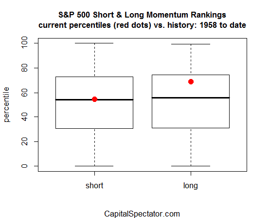
The red dots in the boxplots above reflect the latest percentile rankings for the momentum readings. In the case of the short-term measure, momentum is currently average relative to history (or roughly the 55th percentile). Long-term momentum is a bit higher, at around the 69th percentile. In fact, values inside the boxes—the so-called interquartile range, or IQR—are generally considered middling.
The strongest signals arise when both momentum benchmarks are above or below their respective IQRs. In those relatively rare instances, there’s a persuasive case for expecting that the recent price trend will reverse course. In fact, both short- and long-term momentum, based on the definitions here, were recently at elevated levels. In early March, the short-term signal briefly touched the 82nd percentile while the long-term value was at the 78th rank (March 4). Those were relatively high numbers that suggested that bullish price momentum was at or near a peak for the near term.
Is it coincidence that the S&P 500 has since fallen slightly? Maybe, although momentum analysis isn’t a crystal ball. Nothing else is either. What we do know is that the momentum factor is persistent through time. This has been documented by countless researchers and economists. The main challenge is developing a robust methodology for routinely monitoring this critical risk factor. The sky’s the limit, but we have to start somewhere.
Should you use momentum analysis by itself? No, of course not. Any one risk factor can only tell us so much. But in the grand scheme of managing risk, you should be wary of ignoring momentum. Financial economists have a hard time explaining it, but very few analysts dismiss of Mr. Market’s enduring “anomalies”.
This is good stuff. I enjoy many of the insights you provide through your blog.
Pingback: Friday links: human love of narrative | Abnormal Returns
Pingback: Weekend reads & charts … « Fusion Blog
Pingback: Ranking ETFs On Momentum » The Capital Spectator
Pingback: Ranking ETFs On Momentum
Pingback: Sunday Recap | the yinzer analyst