Chicago Fed Nat’l Activity Index: November 2013 Preview

Here’s a closer look at the numbers, followed by brief definitions of the methodologies behind The Capital Spectator’s projections:

cfnai.20dec2013.gif

VAR-4A: A vector autoregression model that analyzes four economic time series to project the Chicago Fed National Activity Index: the Capital Spectator’s Economic Trend & Momentum Indexes, the Philadelphia Fed US Leading Indicator, and the Philadelphia Fed US Coincident Economic Activity Indicator. VAR analyzes the interdependent relationships of these series with CFNAI through history. The forecasts are run in R with the “vars” package.

VAR-4B: A vector autoregression model that analyzes four economic time series to project the Chicago Fed National Activity Index: US private payrolls, real personal income less current transfer receipts, real personal consumption expenditures, and industrial production. VAR analyzes the interdependent relationships of these series with CFNAI through history. The forecasts are run in R with the “vars” package.

ARIMA: An autoregressive integrated moving average model that analyzes the historical record of the Chicago Fed National Activity Index in R via the “forecast” package.

ES: An exponential smoothing model that analyzes the historical record of the Chicago Fed National Activity Index in R via the “forecast” package.

Personal Consumption Expenditures: November 2013 Preview

Here’s a closer look at the numbers, followed by brief summaries of the methodologies behind The Capital Spectator’s estimates:

pce.20dec2013.gif

VAR-1: A vector autoregression model that analyzes the history of personal income in context with personal consumption expenditures. The forecasts are run in R with the “vars” package.

VAR-3: A vector autoregression model that analyzes three economic time series in context with personal consumption expenditures. The three additional series: US private payrolls, personal income, and industrial production. The forecasts are run in R with the “vars” package.

ARIMA: An autoregressive integrated moving average model that analyzes the historical record of personal consumption expenditures in R via the “forecast” package to project future values.

ES: An exponential smoothing model that analyzes the historical record of personal consumption expenditures in R via the “forecast” package to project future values.

R-1: A linear regression model that analyzes the historical record of personal consumption expenditures in context with retail sales. The historical relationship between the variables is applied to the more recently updated retail sales data to project personal consumption expenditures. The computations are run in R.

US Economic Profile | 12.19.13

The Economic Trend (ETI) and Momentum indexes (EMI) remain at levels that are well above their respective danger zones. Although ETI and EMI have pulled back lately, the declines follow historically high levels and so the mild retreats aren’t threatening at this point. Indeed, most of the indicators used to generate ETI and EMI continue to trend positive. The two exceptions: oil prices and consumer sentiment, although in both cases the negative comparisons have been easing lately. But there’s no mistaking the broad trend, which remains unambiguously positive. Recession risk has been minimal for some time, and remains so, according to the current profile of macro and financial data.

Here’s a closer look at the numbers in recent history via the ETI and EMI indicators:

eco1.19dec2013.gif

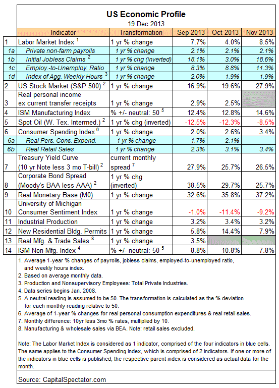
Reviewing ETI and EMI in historical context shows that both benchmarks remain well above their respective danger zones: 50% for ETI and 0% for EMI. If one or both indexes fall below their respective tipping points, that would be a warning that recession risk is elevated.

Translating ETI’s historical values into recession-risk probabilities via a probit model also suggests that business cycle risk is low.

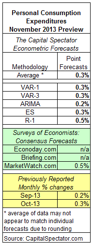
For some perspective on how ETI’s values may evolve as new data is published in the near future, let’s review projected values for this index with an econometric technique known as an autoregressive integrated moving average (ARIMA) model, based on calculations via the “forecast” package for R, a statistical software environment. The ARIMA model estimates the missing data points for each indicator, for each month through January 2014. (September 2013 is currently the latest month with a complete set of published data). Based on this projection, ETI is expected to remain well above its danger zone in the near term. Forecasts are always suspect, of course, but recent projections of ETI for the near term have proven to be relatively reliable guesstimates vs. the full set of monthly reported numbers that followed. As such, the latest projections (the four blue bars on the right in the chart below) offer some support for cautious optimism. For comparison, the chart below also includes ARIMA projections published on these pages in previous months, which you can compare with the complete monthly sets of actual data that followed, based on current data (red circles). The assumption here is that while any one forecast is likely to be wrong, the errors may cancel one another out to some degree by aggregating a broad set of forecasts.

For additional context for judging the value of the forecasts, here are previously published ETI and EMI updates for the last three months:

25 Nov 2013
21 Oct 2013
19 Sep 2013

A Second Week Of Higher Jobless Claims

Initial jobless claims rose 10,000 last week, which follows the previous week’s huge 64,000 surge. The back-to-back increases put claims at a seasonally adjusted 379,000—the highest since March. More troubling is the second week of year-over-year increases, which hasn’t happened since Hurricane Sandy played havoc with the data in November 2012. But there’s no weather-related factor to blame this time.

Let’s not go off the deep end just yet. Keep in mind that claims data is notoriously volatile and so it’s easy to be misled by focusing on the latest data points. Tune in next week when we learn if the last two updates for this data set are deceiving us.

One reason for thinking that today’s report isn’t as ominous as it seems: the encouraging macro profile via a broad set of economic and financial indicators. As I discussed earlier today, the US economy appears to be humming along rather well at the moment, at least through November. The question is whether December will mark a turn for the worse? No, according to the initial December estimates of Markit’s manufacturing and services surveys for the US. But today’s claims report suggests otherwise. Hmmm…

We’ll soon locate the joker in this deck. But for now, there’s a bit more uncertainty about what comes next. If the claims numbers are accurately reflecting rising distress in the labor market, we’ll see corroborating evidence in the days and weeks to come. What should we do in the meantime? The usual prescription applies: wait for more data.

Book Bits | 12.14.13

Turbulent and Mighty Continent: What Future for Europe
By Anthony Giddens
Summary via publisher, Polity
The currency of the European Union, the euro, is used in economic transactions world-wide. Yet the EU is mired in the greatest crisis of its history, one that threatens its very existence as an entity able to have an impact upon world affairs. Europe no longer seems so mighty, instead but faces the threat of becoming an irrelevant backwater or, worse, once again the scene of turbulent conflicts. Divisions are arising all over Europe, while the popularity of the Union sinks. How can this situation be turned around? It is a mistake, argues Anthony Giddens, to see the misfortunes of the euro as the sole source of Europe’s malaise. The Union faces problems shared by most or all of the developed states of the world. Reform in Europe must go far beyond stabilizing the euro, formidable and fraught though that task may be. Introducing an array of new ideas, Giddens suggests this is the time for a far-reaching rethink of the European project as a whole.
Continue reading

Housing Starts Surge To The Highest Level Since 2008

The sharp rise in new construction last month lifts the level of starts to the highest number since February 2008. Another way to consider the data: starts are now running at about twice as high as compared with the number posted during the depths of the Great Recession. The pace of new construction is still roughly 50% under the high points of the housing boom, although some of that was simply excess building that had little if any economic rationale. In any case, it’s clear that housing has recovered quite a lot of lost ground since this market imploded a few years back.

The strong profile that emerges in today’s data minimizes the worrisome signs that had been casting shadows recently. The year-over-year figures for both starts and permits had been trending lower through most of 2013. It wasn’t clear if this was a maturing of the housing recovery or something darker. The future’s still uncertain, of course, but today’s numbers on starts suggests that new construction is in no danger of slipping off the cyclical cliff any time soon.

Although the annual rate of starts turned sharply higher in November, the growth of permits relative to the year-earlier number is closing in on the lowest pace since 2010. For the moment, this isn’t terribly troubling because the current year-over-year pace of around 8% still suggests a healthy round of growth for home building. In fact, that’s the message in this week’s December update of the National Association of Home Builders/Wells Fargo Housing Market Index, which jumped to an eight-year high. “This is definitely an encouraging sign as we move into 2014,” said NAHB Chairman Rick Judson earlier this week. Today’s news on housing starts only strengthens Judson’s outlook.

What’s the risk for housing? Higher interest rates… maybe. When the Federal Reserve starts winding down its stimulus program, rates will move northward. In fact, rates have already moved moderately higher in recent months in anticipation that extraordinary run of monetary stimulus is nearing an end. The 30-Year conventional mortgage rate is currently around 4.4% (based on the national average), or up from roughly 100 basis points since the Spring. For the moment, it’s not obvious that higher rates will damage the housing recovery. But much depends on how fast rates rise and why they rise. If the Fed is tightening policy because economic growth is picking up, that’s a healthy change. For the moment, that’s still a reasonable bet.

The Wide, Wide World Of Performance For US Bonds

Using a set of proxy ETFs to assess the damage, it’s clear that there’s been almost no place to hide when it comes to Treasuries lately. For perspective, let’s also compare US government bonds with the other major sectors of domestic debt for these United States for the trailing 250-day trading period (roughly the equivalent of one year) through yesterday, December 16:

bonds.table.17dec2013.gif

Here’s how the numbers stack up after rebasing the prices of the bond ETFs to 100 as of December 18, 2012. Not surprisingly, the biggest losses are concentrated in the longest maturities, represented here by the iShares 20+ Year Treasury Bond ETF (TLT), which has shed more than 12% over the past 250 trading days:

bonds.17dec2013.gif

As you can see, not every corner of the US bond realm is suffering, at least not yet. Leading the charge with profits: US junk bonds via the SPDR Barclays High Yield Bond ETF (JNK), which is currently higher over the past 250 trading days by slightly more than 5%. Short-term investment-grade corporates (CSJ) also show a slight gain. Even short-term Treasuries (SHY) are in the black, albeit just barely.

The lesson, of course, is to refrain from thinking of US bonds as a monolithic asset class when it comes to portfolio design and rebalancing decisions.

Pondering The Small-Cap Risk Premium

Another way of evaluating relative returns (and considering the historical context in the process) is calculating a rolling 1-year return spread. Let’s take the 1-year return for small caps and subtract the 1-year return for large caps, with the results plotted daily since the mid-1990s:

Using the chart above as a guide, the current small-cap rally has been running strong for more than a year. Although momentum has faltered a bit lately, the small-cap premium is still at a comparatively elevated level at around +8 percentage points. Yes, it’s been higher at times, including a brief, fleeting period in 2000 when the small-cap edge was closing in on an extraordinary spread of +40 percentage points. By that standard, the current premium looks moderate.

The question is whether it’s wise to hold out for even greater gains vs. rebalancing now and taking some profits? Minds will differ, as always, but the track record of reaching for the stars often comes to tears in the money game. That doesn’t mean that small caps won’t continue to dispense outsized returns over large caps in the year ahead. Perhaps, then, it’s wise to rebalance moderately. All or nothing investment decisions can lead to stellar results, but if you’re wrong you’ll pay a hefty price.

Decisions, decisions, although it’s always a good idea to start with first principles before going off the deep end. If you’re inclined to see investing as a risk-management process rather than a return-chasing endeavor, the numbers usually tell you most of what you need to know and when you need to act.

An Upside November Surprise In Industrial Activity

Meantime, it’s hard not to be impressed with the latest numbers. Industrial production’s 1.1% surge for November is the best rate of monthly growth in a year. The sight of the manufacturing slice of activity inching higher in November only strengthens the case for arguing that the expansion in the industrial sector is widespread.

More importantly, the year-over-year numbers show that industrial production’s pace has rebounded in recent months. For the first time since mid-2012, the Fed’s industrial production index has posted annual rates of growth above 3% for three months running. The deceleration that afflicted this indicator in the first half of this year (the low point was this past July’s dip to a mere 1.5% gain over the year-earlier month) has since given way to a substantially stronger set of comparisons.

We also learned today that the initial estimate of the US Manufacturing PMI for December continues to signal a healthy rate of growth through the end of 2013. “The flash PMI remained surprisingly high in December, suggesting strong growth momentum in the goods producing sector,” noted Markit’s chief economist in today’s press release (pdf). That’s a clue for thinking that the encouraging numbers in today’s November industrial production data will carry over into this month when the Fed publishes its next report for this indicator.

It may be a shock in some circles to discover that industrial activity has been growing by 3%-plus a year in recent months, but the broader implications for the business cycle aren’t terribly surprising. Although some pundits are prone to anecdotal evidence and outlier numbers in the regular updates on economic data, a broad review of the big-picture trend has remained consistently upbeat, as the monthly reviews of the Economic Trend & Momentum indices remind (here’s last month’s report, for instance).

Although the strong rise in industrial production for November is only one number, it’s one of several data points that suggest that business cycle risk remains low for the US. That’s been the message all along, albeit with some rocky periods at times. But an objective, broad-minded search for compelling clues that a new recession is near have turned up few persuasive warning signs in recent history. Today’s news on industrial production certainly doesn’t change this record.

US Industrial Production: November 2013 Preview

Monday’s November report on US industrial production (scheduled for release on Dec. 16) is projected to post a 0.3% rise vs. the previous month, based on The Capital Spectator’s average econometric forecast. The expected gain marks a modest rebound after October’s 0.1% decline. Meanwhile, the Capital Spectator’s average projection for November is a bit lower than a consensus forecast via a survey of economists.
Continue reading