Britain’s Ascendancy & Europe’s Decline

‘Tis the season for predictions and all the usual caveats apply. But amid the din of forecasts as the year winds down is one outlook that’s worth a closer a look for what it says about the UK, the Eurozone, and the price tag for embracing a deeply flawed monetary policy inside a misguided currency union.

“The UK is forecast to be the second most successful of the Western economies after the US,” advises the Centre for Economics and Business Research (CEBR) in a new report published today. “Positive demographics with continuing immigration, rather less exposure to the problems of the Eurozone than other European economies combine with relatively low taxes by European standards to encourage faster growth than in most Western economies.” As it travels along the road to recovery, Britain will edge out France to become the fifth-largest economy on the planet in five years, pushing aside Germany to become Europe’s leading economy by 2030, CEBR projects. It seems that the sun is no longer setting on the British Empire in macro terms.

A lot can change between now and five years, to say nothing of what will unfold over the next three decades. But CEBR’s forecast certainly sounds plausible based on what we know about Britain’s economy this year. If you’ve been following the macro news for the UK, you know that it’s been posting encouraging numbers for months. There’s a fierce debate about why Britain’s economy is recovering. There’s also plenty of skepticism about whether the rebound is sustainable or even healthy—some analysts say that it’s overly reliant on a housing boom, for instance.

But there’s no denying that the UK’s generating numbers that stand in sharp relief with the Eurozone—particularly for the Eurozone ex-Germany. If you consider the upbeat economic numbers of late for the US and Japan, Europe’s troubles stand out even more. What explains the difference? Surely monetary policy is a big part of the answer, as Ambrose Evans-Pritchard of The Telegraph explains:

The crippled eurozone alone has chosen to stagger on defiantly without monetary crutches. The result has been a double-dip recession of nine quarters, the longest since the Second World War. The austerity regime has been self-defeating even on its own crude terms. Debt ratios have ratcheted up even faster.

It doesn’t help that the euro has been imposed in a region that falls short of Robert Mundell’s standards for defining an optimal currency area. But the euro isn’t going away, at least not for the immediate future. So, what could change? Perhaps the European Central Bank will embrace monetary stimulus in a more aggressive form in 2014, although it’s clear that policy choices to date have been far too modest to make a dent in the lingering troubles that continue to afflict France, Italy and Spain.

In absolute terms, Britain’s ascendancy of late can be attributed to internal economic momentum, supported by the simple fact that the UK still has its own currency and therefore has dodged the macro headwinds that weigh on countries tethered to the euro. In relative terms vis-à-vis the Eurozone, however, Britain’s strength speaks volumes about the self-inflicted problems on the Continent.

“The UK’s rebound is not because fiscal cuts have been milder than in Europe,” observes Evans-Pritchard. “The squeeze has been roughly comparable over the past three years. The difference is monetary policy. Kudos to the Bank of England, rising to a historic challenge once again.”

God Bless Us, Every One!

Running to the window, he opened it, and put out his head. No fog, no mist; clear, bright, jovial, stirring, cold; cold, piping for the blood to dance to; Golden sunlight; Heavenly sky; sweet fresh air; merry bells. Oh, glorious! Glorious!
‘What’s to-day?’ cried Scrooge, calling downward to a boy in Sunday clothes, who perhaps had loitered in to look about him.
‘Eh?’ returned the boy, with all his might of wonder.
‘What’s to-day, my fine fellow?’ said Scrooge.
‘To-day?’ replied the boy. ‘Why, Christmas Day.’
‘It’s Christmas Day!’ said Scrooge to himself. ‘I haven’t missed it. The Spirits have done it all in one night. They can do anything they like. Of course they can. Of course they can. Hallo, my fine fellow!’

        “A Christmas Carol”
        Charles Dickens

Joyeux Noël

I heard the bells on Christmas Day
Their old, familiar carols play,
     And wild and sweet
     The words repeat
Of peace on earth, good-will to men!

                        “Christmas Bells”
                        Henry Wadsworth Longfellow

Will The Deceleration In Personal Income Growth Spoil The Party?

First, the good news. The big-picture trend for the US economy continues to look encouraging. The three-month average of the Chicago Fed National Activity Index rose to +0.25 in November—the highest since February 2012. As a result, US economic growth is running at its strongest pace in nearly two years.

Consumer spending was also bubbly in November. Personal consumption expenditures (PCE) increased 0.5% last month over October, the best monthly comparison since June and the seventh straight month of higher spending.

“Jobs are growing, confidence is growing, households and asset values are climbing,” notes Paul Edelstein, director of financial economics at IHS. “There appears to be some sort of gathering momentum in the economy.”

So it’s all peaches and cream? Not quite. There’s always something to worry about and the sluggish trend in income growth is at the top of the list these days. Disposable personal income (DPI) increased a light 0.1% in November, which falls short of making up the lost ground in October’s 0.2% decline.

Monthly data is noisy and so it’s best to focus on the year-over-year comparisons for a clearer look at the trend. Unfortunately, the numbers for income don’t look encouraging on this front either. DPI’s annual change continues to slump, rising only 1.5% last month vs. a year ago. That’s a sharp deceleration from October’s 2.6% year-over-year rate. It’s also the second-slowest pace of growth this year.

If income growth continues to slow (or perhaps turn negative in the near future?), that will be a dark sign for consumer spending. For the moment, the two indicators are moving in opposite directions, but the divergence will soon be corrected. The only question: will spending slow or income rise?

The outcome will be favorable if the labor market continues to post improving numbers, as it has in recent months. More jobs, after all, translate into more income. Recent updates have brought modestly better news. The three-month average gain for private payrolls, for instance, has been running at 190,000-plus through October and November. That’s higher than the sluggish 158,000-to-167,000-three-month range during the July-through-September period.

The question is whether this lagging data will soon give way to the darker clouds implied by this month’s worrisome trend in initial jobless claims? New filings for unemployment benefits have surged recently: reaching the highest level since March for the week through December 14. Is this leading indicator dropping bearish clues for 2014? It’s too soon to say. Indeed, claims data is notoriously volatile in the short term. But in the wake of today’s deceleration in personal income, we can’t dismiss the potential, however remote at this stage, that the labor market may hit a new round of turbulence in the months to come. We’ll know morevafter Thursday’s update on jobless claims. The crowd’s expecting some good news: the consensus forecast sees claims dropping by more than a trivial degree, according to Briefing.com.

Meantime, consumers are spending more and economic growth has strengthened. The slowdown in income, however, looks like a speed bump. Perhaps Thursday’s jobless claims data will tell us if we should (or shouldn’t) worry.

Is Inflation Headed Higher In 2014?

Let’s begin by recognizing the US dollar has strengthened over the last two years. The idea that the currency was headed for the ash heap of forex history looks foolish at the moment. The trade-weighted measure of the greenback against the major currencies has been trending higher since 2011 and is roughly unchanged from the months preceding the start of the Great Recession. So much for debasement.

Meanwhile, inflation risk continues to look unusually low. The Fed’s preferred measure—personal consumption expenditures less food and energy, aka core PCE—is rising at just over 1% a year lately, or well below the central bank’s 2% target.

So what might alter inflation’s trend and move us closer to the dark fears of the hard money crowd? The sky’s the limit when it comes to possibilities. If you’re looking for colorful narratives on how inflation will threaten these United States, the world is awash in hazardous potential. Reasonable narratives, on the other hand, are another matter. In any case, the future’s still uncertain but one of the more intriguing outlines of what may happen is bound up with how the Fed will reduce its balance sheet in the months and years ahead. It remains to be seen if the reversal of monetary stimulus will be handled smoothly, in which case inflation’s inevitable rise will be a relatively low-risk affair. But there’s no guarantee. So what should we expect for inflation? On that question, one dismal scientist outlined a framework that’s worthy of attention.

David Beckworth observes that the annual rate of change in the Fed’s holdings of Treasuries lately has a tendency to lead the core inflation by roughly six to nine months, as the chart below shows. Note that the year-over-year rate in Treasury holdings (red line) has been trending higher since late-2012, rising more than 30% recently vs. the same period a year ago. Year-over-year core PCE inflation, however, has yet to react (blue line). But with recent economic data looking relatively upbeat—including last week’s upward revision in third-quarter GDP–one can only wonder if inflation is poised to trend higher.

It’s getting easier to imagine a world with firmer pricing pressures. But first let’s see what happens with this week’s jobless claims update on Thursday. New filings for unemployment benefits have jumped sharply lately. For now, this warning is the outlier relative to most macro data. But if the dark trend in new claims rolls on, the case for assuming that inflation will perk up will look unconvincing, in part because we should expect the Fed to rethink its tapering program that started last week. One the other hand, if this Thursday’s claims report looks encouraging, maybe inflation is headed higher in 2014 after all.

Best of Book Bits 2013 (Part I)

Successful Investing Is a Process: Structuring Efficient Portfolios for Outperformance
By Jacques Lussier
Summary via publisher, Bloomberg/Wiley
What do you pay for when you hire a portfolio manager? Is it his or her unique experience and expertise, a set of specialized analytical skills possessed by only a few? The truth, according to industry insider Jacques Lussier, is that, despite their often grandiose claims, most successful investment managers, themselves, can’t properly explain their successes. In this book Lussier argues convincingly that most of the gains achieved by professional portfolio managers can be accounted for not by special knowledge or arcane analytical methodologies, but proper portfolio management processes whether they are aware of this or not. More importantly, Lussier lays out a formal process-oriented approach proven to consistently garner most of the excess gains generated by traditional analysis-intensive approaches, but at a fraction of the cost since it could be fully implemented internally.

After the Music Stopped: The Financial Crisis, the Response, and the Work Ahead
By Alan Blinder
Interview with author via The New York Times
Q: You write, “Our best hope is to minimize the consequences when bubbles go splat — and they inevitably will.” How much confidence do you have that when the next bubble goes splat, we will be ready, willing and able to contain the damage?
A: Less than I wish I had. But I’m at least hopeful that some of the lessons we’ve learned, and some of the actions we’ve taken, will make the next bubble less damaging than the last ones. For example, we now understand better the dangers that lurk in high leverage, overly complex financial instruments, and lax (or nonexistent) regulation.

Skating Where the Puck Was: The Correlation Game in a Flat World
By William Bernstein
Review via The Chicago Tribune
This time of year, many investors begin to reflect on the past 12 months in the market. Did stocks sail higher than bonds? Was it better to own Apple or Google? Did some mutual funds outperform others?
It’s certainly OK to do this type of review, but if it tempts you to make drastic changes in your portfolio, experts say to watch out. You may be doing more harm than good.
That was one of the conclusions that William Bernstein, a financial adviser and author, made in his new e-book, “Skating Where the Puck Was: The Correlation Game in a Flat World.”Bernstein found that even among institutional investors — the pros who manage university endowments and public pension funds — there is a tendency to chase after the next “big idea.”

Naked Statistics: Stripping the Dread from the Data
By Charles Wheelan
Review via The Economist
Data are everywhere these days; the problem is making sense of them. That is the role of statistics, the university course that so many people dodge or forget. Charles Wheelan, a professor at Dartmouth College (and a former Chicago correspondent for The Economist), does something unique here: he makes statistics interesting and fun. His book strips the subject of its complexity to expose the sexy stuff underneath.

Forecast: What Physics, Meteorology, and the Natural Sciences Can Teach Us About Economics
By Mark Buchanan
Column by author via Bloomberg
In the not-too-distant future, it’s easy to imagine a U.S. or European Center for Financial Forecasting. Thousands of researchers would oversee massive simulations probing the developing network of interactions among the world’s largest financial players, following the vast web of loans, ownership stakes and other legal claims that link banks, governments, hedge funds, insurance companies and ratings companies.
The computers would test scenarios and calculate hundreds of indicators of systemic leverage, the density of interconnections, or the concentration of risk at single institutions. Experts would probe models of the financial system, looking for weak points and testing resilience, much as engineers now do with models of the electrical grid or other complex systems.

Chicago Fed Nat’l Activity Index: November 2013 Preview

Here’s a closer look at the numbers, followed by brief definitions of the methodologies behind The Capital Spectator’s projections:

cfnai.20dec2013.gif

VAR-4A: A vector autoregression model that analyzes four economic time series to project the Chicago Fed National Activity Index: the Capital Spectator’s Economic Trend & Momentum Indexes, the Philadelphia Fed US Leading Indicator, and the Philadelphia Fed US Coincident Economic Activity Indicator. VAR analyzes the interdependent relationships of these series with CFNAI through history. The forecasts are run in R with the “vars” package.

VAR-4B: A vector autoregression model that analyzes four economic time series to project the Chicago Fed National Activity Index: US private payrolls, real personal income less current transfer receipts, real personal consumption expenditures, and industrial production. VAR analyzes the interdependent relationships of these series with CFNAI through history. The forecasts are run in R with the “vars” package.

ARIMA: An autoregressive integrated moving average model that analyzes the historical record of the Chicago Fed National Activity Index in R via the “forecast” package.

ES: An exponential smoothing model that analyzes the historical record of the Chicago Fed National Activity Index in R via the “forecast” package.

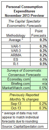
Personal Consumption Expenditures: November 2013 Preview

Here’s a closer look at the numbers, followed by brief summaries of the methodologies behind The Capital Spectator’s estimates:

pce.20dec2013.gif

VAR-1: A vector autoregression model that analyzes the history of personal income in context with personal consumption expenditures. The forecasts are run in R with the “vars” package.

VAR-3: A vector autoregression model that analyzes three economic time series in context with personal consumption expenditures. The three additional series: US private payrolls, personal income, and industrial production. The forecasts are run in R with the “vars” package.

ARIMA: An autoregressive integrated moving average model that analyzes the historical record of personal consumption expenditures in R via the “forecast” package to project future values.

ES: An exponential smoothing model that analyzes the historical record of personal consumption expenditures in R via the “forecast” package to project future values.

R-1: A linear regression model that analyzes the historical record of personal consumption expenditures in context with retail sales. The historical relationship between the variables is applied to the more recently updated retail sales data to project personal consumption expenditures. The computations are run in R.

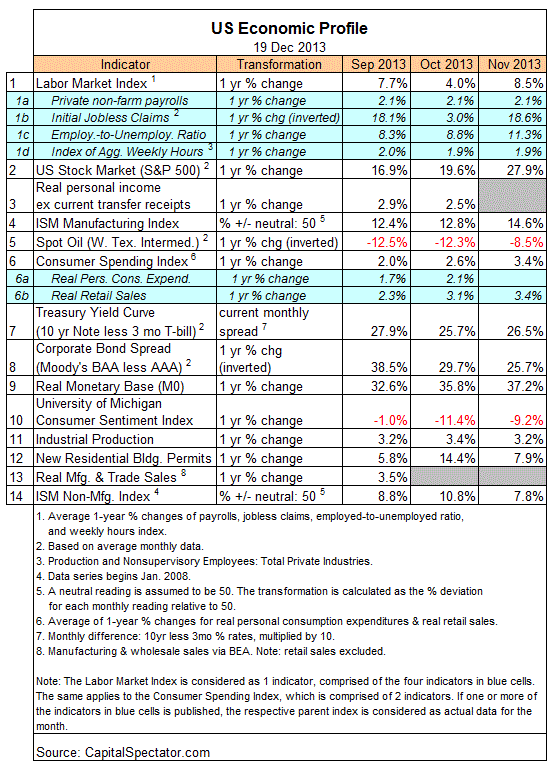
US Economic Profile | 12.19.13

The Economic Trend (ETI) and Momentum indexes (EMI) remain at levels that are well above their respective danger zones. Although ETI and EMI have pulled back lately, the declines follow historically high levels and so the mild retreats aren’t threatening at this point. Indeed, most of the indicators used to generate ETI and EMI continue to trend positive. The two exceptions: oil prices and consumer sentiment, although in both cases the negative comparisons have been easing lately. But there’s no mistaking the broad trend, which remains unambiguously positive. Recession risk has been minimal for some time, and remains so, according to the current profile of macro and financial data.

Here’s a closer look at the numbers in recent history via the ETI and EMI indicators:

eco1.19dec2013.gif

Reviewing ETI and EMI in historical context shows that both benchmarks remain well above their respective danger zones: 50% for ETI and 0% for EMI. If one or both indexes fall below their respective tipping points, that would be a warning that recession risk is elevated.

Translating ETI’s historical values into recession-risk probabilities via a probit model also suggests that business cycle risk is low.

For some perspective on how ETI’s values may evolve as new data is published in the near future, let’s review projected values for this index with an econometric technique known as an autoregressive integrated moving average (ARIMA) model, based on calculations via the “forecast” package for R, a statistical software environment. The ARIMA model estimates the missing data points for each indicator, for each month through January 2014. (September 2013 is currently the latest month with a complete set of published data). Based on this projection, ETI is expected to remain well above its danger zone in the near term. Forecasts are always suspect, of course, but recent projections of ETI for the near term have proven to be relatively reliable guesstimates vs. the full set of monthly reported numbers that followed. As such, the latest projections (the four blue bars on the right in the chart below) offer some support for cautious optimism. For comparison, the chart below also includes ARIMA projections published on these pages in previous months, which you can compare with the complete monthly sets of actual data that followed, based on current data (red circles). The assumption here is that while any one forecast is likely to be wrong, the errors may cancel one another out to some degree by aggregating a broad set of forecasts.

For additional context for judging the value of the forecasts, here are previously published ETI and EMI updates for the last three months:

25 Nov 2013
21 Oct 2013
19 Sep 2013

A Second Week Of Higher Jobless Claims

Initial jobless claims rose 10,000 last week, which follows the previous week’s huge 64,000 surge. The back-to-back increases put claims at a seasonally adjusted 379,000—the highest since March. More troubling is the second week of year-over-year increases, which hasn’t happened since Hurricane Sandy played havoc with the data in November 2012. But there’s no weather-related factor to blame this time.

Let’s not go off the deep end just yet. Keep in mind that claims data is notoriously volatile and so it’s easy to be misled by focusing on the latest data points. Tune in next week when we learn if the last two updates for this data set are deceiving us.

One reason for thinking that today’s report isn’t as ominous as it seems: the encouraging macro profile via a broad set of economic and financial indicators. As I discussed earlier today, the US economy appears to be humming along rather well at the moment, at least through November. The question is whether December will mark a turn for the worse? No, according to the initial December estimates of Markit’s manufacturing and services surveys for the US. But today’s claims report suggests otherwise. Hmmm…

We’ll soon locate the joker in this deck. But for now, there’s a bit more uncertainty about what comes next. If the claims numbers are accurately reflecting rising distress in the labor market, we’ll see corroborating evidence in the days and weeks to come. What should we do in the meantime? The usual prescription applies: wait for more data.