The repricing of risk in the capital and commodity markets may be intimidating, but it’s a natural, recurring process, and one that often brings fresh opportunity (along with new and so perhaps unexpected risks) for strategic-minded investors.
Periodic rebalancing as a general rule is a good idea, perhaps more so than usual these days given the rise in volatility in some asset classes and the growing sense that more than the usual demons haunting the markets and the economy may be lurking in the shadows. All of which provides a timely excuse to update the correlation trends between stocks, bonds, REITs and commodities if only to see how the recent turmoil in markets has reshuffled the relationships between the asset classes.
To keep things manageable, we’ve crunched the correlations from a U.S. stock market perspective (see chart below by clicking for larger image). The decision doesn’t mean that looking at correlations from the vantage of bonds or REITs or commodities is unproductive. Indeed, a full and prudent study of correlations demands considering all the angles. But in the interest of brevity, today we look exclusively at how correlations have evolved vis a vis U.S. equities, as represented by the Russell 3000, which is a broad measure of the market.
click for larger image
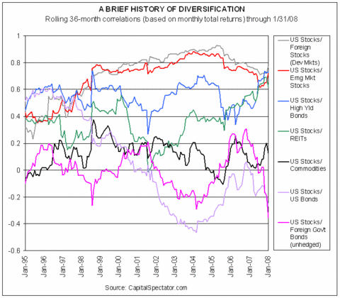
Indices used in calculation: Russell 3000, Lehman Bros. Aggregate Bond, DJ Wilshire REIT, DJ-AIG Commodity, iBoxx High Yield, Citigroup
Non-$ World Govt (un Hdg, $), MSCI EAFE, MSCI EM
Before we start analyzing the trends, let’s first define some terms. The chart above profiles 36-month rolling correlations based on monthly total returns for the respective markets. For example, the correlation between U.S. stocks and commodities for January 2008 comes from a correlation derived on the previous 36-month total returns for each asset class. Correlation measures the relationship between two data series, in this case monthly total returns. A correlation of 1.0 equates with perfect positive correlation, meaning that the two markets are effectively one and the same, or at least highly similar. A correlation reading of 0.0 is no correlation, and a correlation of -1.0 is perfect negative correlation. And, of course, there’s a strong case for building portfolios by mixing asset classes with low and negative correlation. The devil’s in the details, but as a general rule this one carries a lot of weight in our book.
Monthly Archives: February 2008
WILL THE PEAK HOLD?
The theory of peak oil remains as contentious as ever and by definition unresolved. The supporting evidence starts with the bull market in crude prices in recent years, inspiring some to proclaim that global production is about as high as it ever will be.
The optimists counter that technology will save the day, through new discoveries that offset declining production from aging fields and recovering more oil from older wells that would otherwise run dry.
The jury is still out on the big picture, and it may remain so for years. In the meantime, there is no shortage of data to review. Case in point: the reported peak (so far) in global crude oil production came in May 2005 at 74.3 million barrels per day (bpd), as our chart below shows, according to numbers from the U.S. Energy Information Administration. In fact, there’s been only three months when global production crossed above 74 million bpd, the latest one coming last October at 74.1 million bpd, or just below the May 2005 summit.
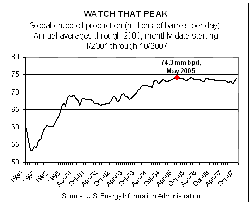
It’s any one’s guess if the old high will stand or not. And, of course, there are questions about the accuracy of EIA’s numbers. In fact, there’s skepticism regarding any database attempting to consolidate such an unwieldy beast as the world’s oil production into one number. Nonetheless, everyone will be watching the updates, eager to declare victory for their side. All the more so considering how close last October’s total was to the May 2005 apex. As we write, EIA’s monthly production figures run through October 2007; the November report is coming soon.
Meantime, as the world ponders the supply side of the oil market, there’s far less mystery on the demand side. In fact, it’s the same old story: up, up and away.
26 YEARS AND COUNTING…
There’s been a lot of talk of bubbles lately, including speculation on where the next one lies. Some say it’s in the energy sector; others claim that gold’s a bubble. Here’s our nomination: bonds.
Our proxy for fixed-income is the ever-popular 10-year Treasury, the benchmark for U.S. debt markets and in some cases foreign markets too. Exhibit A in our bubble thesis is the chart below, which shows the daily closing yield of the 10 year for 40 years-plus through last night’s close. Restating the graphically obvious: the great decline in yield for the past 26 years. Since the peak of 15.84%, set on September 30, 1981, the 10-year Treasury’s yield has, with fits and starts, become a shadow of its former self.
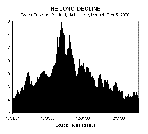
As of yesterday’s close, the 10 year trades at 3.61%–a tidy 1200 basis points below the 1981 summit. In fact, that’s not the lowest yield in recent memory. In June 2003, the 10-year yield briefly dipped to 3.20% (measured by daily closes) and 3.09% on an intraday basis. As we write, those troughs are theoretically just a few trading sessions away–if the bond market is willing.
So far, the fixed-income set has seen fit to follow the Federal Reserve down the slippery slope of fading rates. That’s unsurprising, given that falling rates are the fuel that’s lifted bonds to the upper levels of the performance horse race among the major asset classes. No wonder, then, that bonds generally have been faring well recently in relative and absolute performance terms. The iShares Lehman Aggregate Bond ETF (AGG), for example, boasts a 2.5% total return so far this year through yesterday and 8.9% for the past 12 months. Inflation-indexed Treasuries and foreign bonds in developed markets, along with the broad commodity indices, have done even better over those time frames. Otherwise, lesser performance and red ink prevail among the major asset classes.
TAXES IN THE REARVIEW MIRROR
Taxes are forever topical, especially in an election year, particularly one in which big ideas about government programs, old and new, are increasingly front and center. Government action, of course, means government spending, which in turn leads to the inevitable question: Who’s going to pay for it?
With that backdrop we offer a bit of perspective about where we’ve been. The future of tax policy is, as always, unclear. The past, by contrast, is eternally crystal. In the February issue of Wealth Manager, your editor took a look backward, if only as an antidote to the bull market in political-speak. By this reporter’s reckoning, a dose of context is always useful and sometimes it’s even refreshing.
STORMY WEATHER
After 52 straight months of gains, job growth finally gave way in January.
The Labor Department reported that non-farm payrolls dipped by 17,000 last month, the first case of red ink since August 2003. Granted, a loss of 17,000 in a labor pool of nearly 159 million is insignificant. In fact, we wouldn’t rule out a revision to positive territory next month. Indeed, the first report of December’s paltry 18,000 rise in nonfarm payrolls was revised up today to a more respectable 82,000 gain.
But revisions can’t reverse the downturn now gathering momentum throughout the economy. The all-important trend in job creation is clearly downshifting. It’s obvious in one-month and 12-month comparisons. And as today’s numbers suggest, the warning signs are no longer confined to manufacturing.
The service sector, which accounts for more than 80% of U.S. employment, eked out a tiny gain last month, creating just 34,000 new jobs. That’s a rounding error in the context of 116 million people working in the service sector. It’s also the first time since October 2005 that the service sector employment growth was effectively flat.
THE JANUARY EFFECT
Asset allocation has regained its rightful place as the only game in town for strategic-minded investors, as January’s tally of performance among the major asset classes reminds.

The range of returns was a robust 14.1 percentage points last month among the major asset classes. On top: foreign developed market bonds, which posted a 5.2% total return in January, by way of our proxy, the PIMCO Foreign Bond (Unhedged) D mutual fund. At the bottom was emerging market stocks, which shed 8.9%, as per iShares MSCI Emerging Markets ETF.
Long gone are the days when everything went up, which meant that the stakes tied to asset allocation and rebalancing were minimal. In 2008, the reverse is true and rising volatility and falling correlations among the major asset classes are the reasons. We expect no less going forward.
As the economic cycle turns, risk is reassessed and repriced on a case-by-case basis. Investors will become increasingly selective in weighing the potential outlook of bonds vs. stocks, domestic vs. foreign, commodities vs. equities, and so on. Such discriminating behavior fell on hard times during 2002-2007. But the fog is thicker than usual for gazing into the future, and investors are becoming more discerning.