What’s the outlook for inflation?
The question is simple enough. But the answer is complicated these days. In fact, there’s an array of inflation expectations to pick from in the summer of 2008. If you’re looking to commodity prices as an early warning sign of future pricing trends, the message has been clear: inflation will rise in the months and years ahead.
Skeptical? Perhaps the recent updates on consumer and wholesale price inflation will change your mind. As we noted yesterday, the trend in producer prices has been unmistakably up. Meanwhile, consumer price inflation shows similar symptoms.
Expecting inflation to continue bubbling, in other words, seems like a reasonable proposition. Or so recent history suggests. But such thinking finds no favor in the Treasury market. The prospect of higher inflation is a bond investor’s worst nightmare, but you’d never know it by looking at the CPI-adjusted yield on the nominal 10-year Treasury. Buyers of the 10 year apparently have no fear of buying a fixed-rate bond at a yield that, after adjusting for consumer price inflation for the past year, looks somewhat unappetizing.
Author Archives: James Picerno
PRICE STABILITY IS A TERRIBLE THING TO WASTE
Hope is a wonderful thing, but at some point it becomes the enemy. It’s hard to know exactly when a friend turns foe, especially when so many of the old rules go out the window. Hindsight, in other words, is the only true source of clarity, which leaves mere mortals like us with the thankless task of dissecting trends in real time. Good luck with that, as they like to say down at the University of Hard Knocks.
Once again, our work is cut out for us with the challenge du jour: deciding if today’s update on wholesale prices reflects momentum or another irregular set of data that will soon reverse. As a preview, it’s safe to say that at face value the numbers look bad. The Producer Price Index for July jumped 1.2%, the Bureau of Labor Statistics reports. The good news is that the 1.2% pace is down from June’s nosebleed 1.8% rise. But that’s about the extent of the positive-spin potential in today’s PPI numbers.
On a rolling 12-month basis, PPI is now surging upward by 9.8% a year, as of last month. That’s the highest annual rate since 1981, when inflation was universally hailed as a threat to the economy and livelihoods of the men and women in the street. It’s debatable how the Federal Reserve views PPI and other pricing data these days, but it’s clear what the consensus was among monetary authorities all those years ago.
Meanwhile, forget about looking to core PPI as a reason for optimism that pricing momentum isn’t as bad as headline PPI suggests. PPI less food and energy rose by 3.6% for the 12 months through July 2008–the highest since 1991. As our chart below reminds, this surge in core PPI is no recent event. Upward momentum in core PPI has been building for some time. And as economic history so clearly teaches, slowing if not ending a runaway train in matters of pricing takes time; and the longer the train rolls on, the higher the economic price tag.

Considering that PPI is advancing at a time when consumer prices also look threatening suggests that now is a time for action. Why, then, does the Federal Reserve sit on its monetary hands by keeping interest rates unchanged at a 2% Fed funds rate? The answer of course can be summarized by the phrase “dual mandate.” The Fed, in contrast to its European counterpart, must promote economic growth and minimize inflation. This may or may not be a plus, but it’s definitely a burden. Is it a burden that exceeds the limits of central banking? We may soon find out. Let’s just say that your editor is keeping an open mind as to the outcome, at least for the conclusion of this cycle.
IS DOLLAR-BASED SALVATION COMING?
The hope that the troubling surge in inflation will soon pass draws on fresh hope born of the widely reported outlook for new-found strength in the dollar. And the hope doesn’t come a moment too soon.
As we reported last week, the July report on consumer prices was sobering, one of the worst in recent memory. In particular, the upwardly mobile core rate of inflation suggests that inflationary pressures born of the bull market in commodities is now spilling over into other areas of the economy.
But that was last week. Many analysts are now expecting the dollar’s reversal of late will come to the rescue. The assumption is that dollar can keep climbing, or at least won’t return to its bear market status any time soon.
One analyst spoke for many with a forecast that the formerly battered buck is headed for better days. “The fundamental picture for the dollar has improved substantially in recent weeks,” Fiona Lake of Goldman Sachs told the Financial Times over the weekend. “As a result, we now think the dollar has bottomed.”
A TURNING POINT FOR CORE?
Today’s update on consumer prices could hardly send a clearer message: pricing pressure is rising, and it’s no longer just about energy. Food prices are now a problem as well. Having jumped 6.0% over the past 12 months, food is now advancing faster than overall consumer inflation.
The Federal Reserve can make a political decision to attack the beast or leave him be. If it’s the latter, the central bank can’t blame ambiguous data for consumer prices as the rationale.
Last month, headline CPI rose 0.8% on a seasonally adjusted basis. Yes, that’s down from June’s 1.1% surge, although that’s cold comfort once you realize that 0.8% is still near the highest monthly readings for the past 20 years. Even more troubling is the fact that CPI has climbed 5.6% over the past year through July, the likes of which haven’t been seen since the early 1990s.
But how about our fail-safe response that core inflation is still under control? That, too, is starting to look thin. CPI less food and energy prices advanced 0.3% last month, which translates to a 2.5% annual pace. The hope that core inflation would slip down to the 2.0% neighborhood has, for the moment, faded.
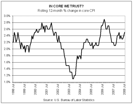
This is a critical change. Recall that 2.0% is widely reported as the Fed’s upper band of tolerance for core CPI. The fact that Bernanke and company have stomached annual core inflation above 2.0% for several years has recently been rationalized as a temporary oversight that would soon be corrected once the economy slows, which in turn would take the edge off pricing pressures.
RETAIL WORRIES
It comes as no surprise, but it’s bracing just the same.
U.S. retail sales slipped last month, falling 0.1% from June’s level, based on a seasonally adjusted calculation, the government reports. Meanwhile, for the 12 months through July, retail sales rose a modest 2.7%. The casual observer may think that the numbers don’t look so bad. Year-over-year growth, after all, is still growth, and in the current environments that’s pretty good. Putting the numbers in economic context, however, suggests that the slowdown of late still has the upper hand.
Consider the chart below, which shows the rolling percentage changes in retail sales on a monthly and annual basis through July 2008. The red line shows that July suffered the first monthly decline in retail sales since February. Meanwhile, the black line reminds that year-over-year retail sales continued to retreat in relative if not absolute terms.

Clearly, the slowdown in retail sales is unmistakable. The broader trend can’t be denied. But that only reveals what’s passed. Thus, the two burning questions: How much longer will the downtrend go on? How bad will it get?
MAN BITES ASSET ALLOCATION
Is extremism in the pursuit of asset allocation a vice or a benefit? To be precise, is routinely holding one asset class to the exclusion of all others a wise choice for the long run?
Anecdotal evidence suggests that most strategists prefer a broad array of asset classes for clients. Arguably, history backs up the advisability of diversification as a prudent strategy when measuring portfolio results in risk-adjusted performance terms. The fact that 50 years of finance theory lends a supporting academic hand to the idea doesn’t hurt either.
Nonetheless, seeing how the other half lives is useful, if only to strengthen one’s decisions. Or, perhaps a fresh perspective will raise new questions and lead to new insights. In any case, your editor came across a financial advisor who has some very definite views on the issue of asset allocation. In particular, he abstains from diversification completely, instead choosing investment grade bonds as the one and only asset class for clients.
That’s an extreme strategy, at least by the standards of what passes for normal on these digital pages and conventional wisdom in the financial planning community. Why would an advisor recommend that clients avoid most of the world’s asset classes sans high-grade bonds issued in the U.S.? In the current issue of Wealth Manager, we asked the question, and more, to an advisor who prefers bonds all the time. For his responses, read on…
RANTING ABOUT RISK (AGAIN)
Failure imparts more lessons than triumph in money management. Success too often breeds hubris and excess confidence; disappointment invites analysis and reflection about what went wrong, why it went wrong and how to make sure the same mistakes aren’t repeated.
Progress in finance and economics, in other words, relies more on failure than success. The truism comes to mind after reading the “confessions” from a “risk manager at a large global bank” in the latest issue of The Economist.
Might progress one day come even before the trouble starts? Perhaps, although the problem is the nature of the beast. Risk is a slippery concept, in part because its preferred method of arrival is in the guise of sheep’s clothing. As the anonymous confessor in The Economist relates, risk has a nasty habit of appearing when common sense suggests otherwise.
“In January 2007 the world looked almost riskless,” the risk manager recalls. “At the beginning of that year I gathered my team for an off-site meeting to identify our top five risks for the coming 12 months. We were paid to think about the downsides but it was hard to see where the problems would come from. Four years of falling credit spreads, low interest rates, virtually no defaults in our loan portfolio and historically low volatility levels: it was the most benign risk environment we had seen in 20 years.”
It was also a time ripe with peril. The fact that few could see it, including the professionals paid to do just that, is a potent reminder that staying vigilant on the risk management front is an ongoing chore, particularly when it seems that risk is nowhere in sight.
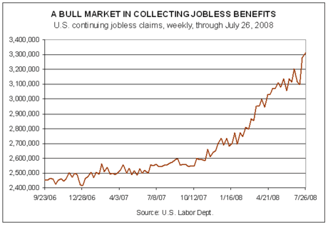
MORE TROUBLE IN THE WEEKLY JOBLESS NUMBERS
The Labor Department brings more bad news this morning. The short summary: new filings for unemployment benefits rose again last week, as did the rolls of those previously collecting jobless benefits.
As our first chart below reminds, the trend in jobless claims continues to deteriorate, which is to say that the population of the unemployed is still expanding. Last week new filings rose to 455,000, the highest since 2002.

The news isn’t any better for the ranks of the formerly employed who continue collecting unemployment checks. As the second graph below illustrates, continuing jobless claims jumped again for the week through July 26 to 3.311 million, an elevation that hasn’t been seen since 2003.
The two trends are hardly surprising, given the broader perspective on the weakening economy, as we discussed yesterday. Expected or not, today’s news for the job market will provide another jolt of bearish realism to those who think that a rebound from recent ills is imminent.
The economic weakening will get better before it gets worse, in other words. That doesn’t mean the pain will get materially worse, although no one should rule out the possibility. But the general trend, at least, is clear. Only the duration and magnitude are in question.
BENCHMARKING THE ECONOMY
With the last of the June economic data in hand, it’s time to update the CS Economic Index, which is calculated monthly. As our chart below shows, and anecdotal evidence suggests, the U.S. economy is weak and getting weaker.

The black line in the chart above, which runs through June 2008, is our broad measure of U.S. economic activity, comprised of 17 variables, ranging from nonfarm payrolls to retail sales to business loans. The index’s biggest weighting (a bit more than 40%) is comprised of leading indicators, which are those measures (such as new building permits and disposable personal income) of economic activity that are considered as windows into the future. Another 30% of our broad economic index is made up of coincident indicators with the remaining 30% in lagging indicators. In short, the CS Economic Index is designed to measure broad economic activity, giving a modest bias to leading indicators.
With that in mind, we take no comfort from the relatively sharp decline in the leading component of our index (the red line in the chart above). As you can see from the graph, the leading indicators are signaling that there are more challenges ahead. In fact, the leading indicators have been flashing warning signs for some time now, although the downside momentum has only been bubbling since late last year.
HOLDING ON…FOR NOW
This morning’s update on personal income and consumer spending is a complicated beast. On first glance, it looks like the great American income machine has stumbled, and stumbled badly. But looks can be deceiving. Maybe.
The first order of business in digesting today’s report on personal income and outlays is looking at the big negative: disposable personal income dropped by a hefty 1.9% (seasonally adjusted) in June. This is income that’s left over after Joe Sixpack has paid his bills and so it’s a key number about his capacity for running to the mall and picking up an extra TV. In short, this is the front line measure of the American economy’s growth potential. GDP, after all, is overwhelmingly dependent on consumer spending. As such, the 1.9% drop in DPI–the first slump since April 2007 and the biggest decline since August 2005–looks ominous, as our chart below suggests.

But the DPI drop isn’t quite as painful as it appears. Note in the chart above the large bump in May that precedes June’s drop. The rise in DPI is courtesy of the government’s stimulus checks. The stimulus is temporary, of course, and so its effects are beginning to fade. No great surprise. If we take out the anomalous jump in May’s DPI, June’s level of DPI is at an all-time high.
The key issue is deciding how much additional DPI fading awaits. Logic suggests we’ll return to trend, short of another round of stimulus. By that reckoning, DPI will fall in the coming months, perhaps to the $10.6 trillion level for August or September. That not-unreasonable assumption means that the market has to brace itself for more red ink on the DPI ledger. Such declines will look troubling, but they won’t signal much more than the aging effects of stimulus checks. Up to a point, that is. Indeed, one might reasonably think that DPI is due for some additional retrenching due to the various economic ills of late. In that case, DPI declines may run on for longer than the optimists expect.